
My Neighbor Totoro Illustrator Architecture

Overview
Truly one of my great loves is creating architecture in Illustrator. It's mechanical, calculated, precise, and relaxing. Here's the first in a small series of Studio Ghibli pieces and some details on how I’ve created the vector illustration.
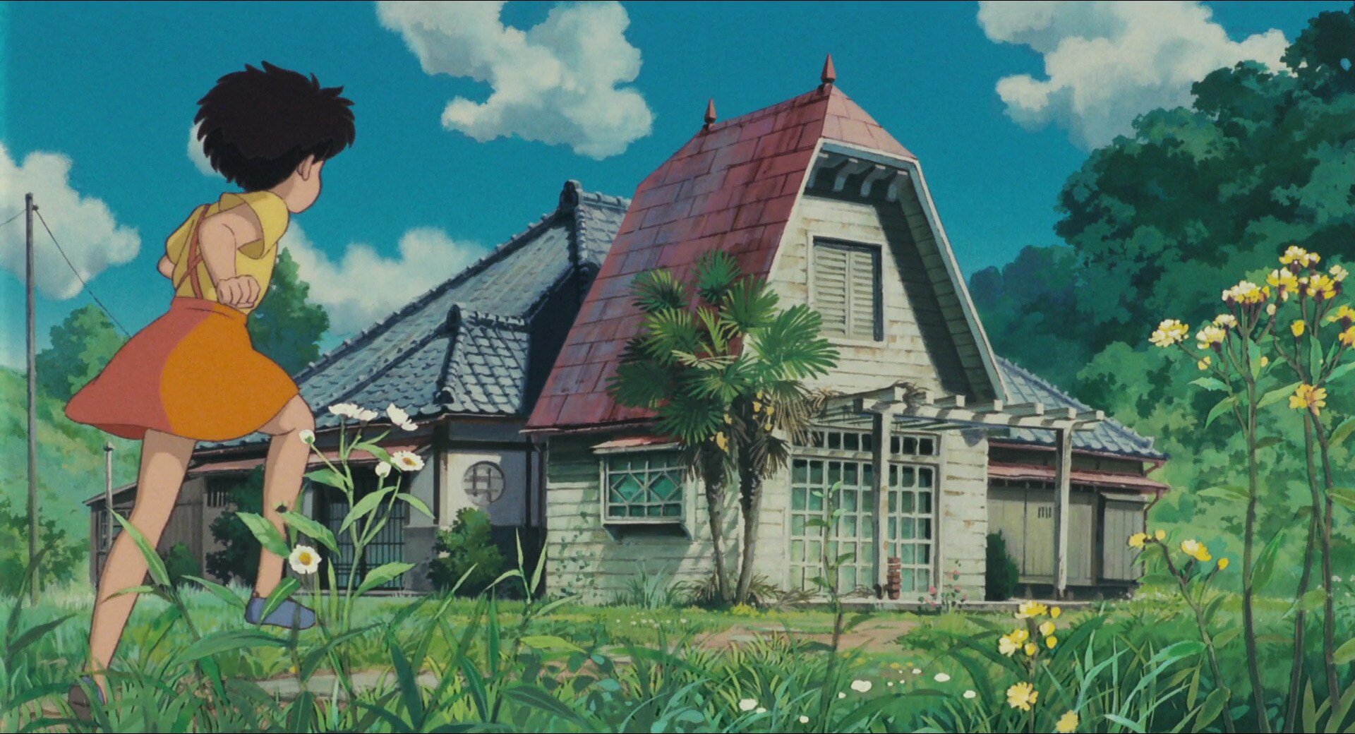
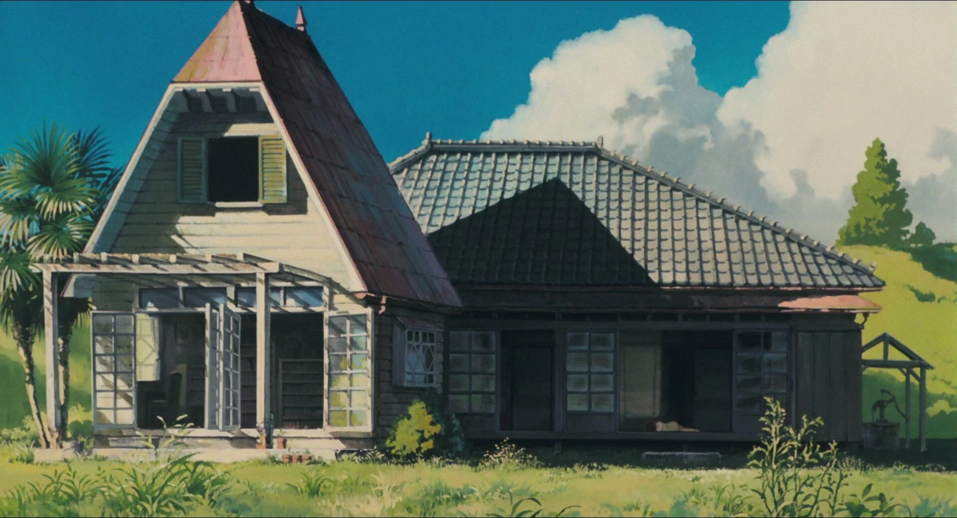
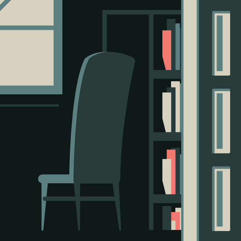
Enjoy the iconic house from My Neighbor Totoro – my favorite, coziest, and most beautifully understated dwellings in any animated film. This is where I want to live – soot sprites and all!
Reference
For these Studio Ghibli architecture illustrations, I used reference images found at Animation Screencaps. It’s best to gather a few samples because the fine details in most Ghibli films vary from shot to shot.


Palette
This illustration uses a limited 5-color palette, inspired by the green and red roof tiles seen in the above screen captures. Each color in my Illustrator swatch panel will be defined as a global to allow quick changes and experimentation later.


I always use HSB for my color mode (in a CMYK doc), it’s by far the easiest to adjust.
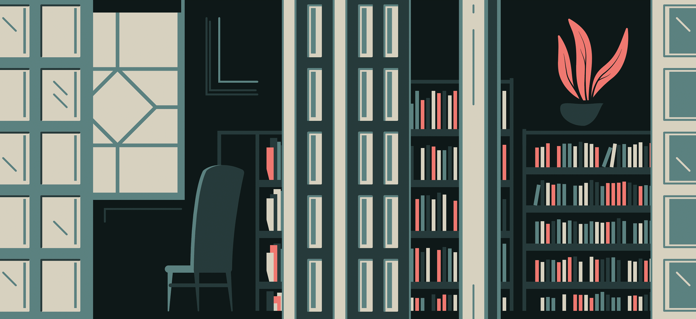
General Construction
Large structures are always roughed in first to get the general shape and composition nailed down. Strokes and outlines are then added to give more definition. To maintain a consistent visual style, I try to stick with two or three line weights.
All shapes and lines are placed/snapped to a grid, which helps to keep things structured and clean. 3-point perspective and other dimensional angles have been flattened to create more of a 2D or skewed view.

The bookshelves, roof tiles, siding, shutters, and other repeating patterns are all blended shapes using Object > Blend > Make. The books were further modified with random colors from the palette and transformed to have various heights.


Textures
The background sky and red roof use photos as textures, instead of vector lines and shapes. The design is pretty dense already, so something more subtle and even-toned will work well. I wanted to create a single color pixel texture, which is easy enough in Photoshop:
Step 1 – Photoshop:
Each photo is scaled and edited in Photoshop by first changing the color mode to grayscale using Image > Mode > Grayscale.
Curves are then adjusted for contrast and general balance with Ctrl+M or ⌘+M.
The final step is to convert the image into a bitmap with Image > Mode > Bitmap. I used diffusion dither, but other types like halftone will result in some really sexy effects. Experiment with the output size to adjust the weight of the dither pixels.
Save the finished image as a PSD.
Note: Leave Photoshop open; you’ll likely want to fine tune the image after seeing how it looks in Illustrator.

Photo by Sam Schooler on Unsplash.

Image is changed to grayscale and inverted.

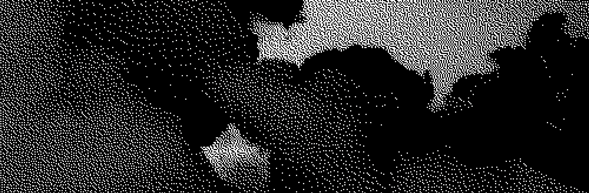
Detailed view of the single color bitmap.
Step 2 – Illustrator:
Place the fresh bitmap PSD into Illustrator with File > Place…
Do not resize the image as it will create a moire pattern or other silly nonsense.
To keep the dither pixel size consistent across several photos (i.e. the sky and the roof), each photo should be scaled to the intended final size in Photoshop first.
If any changes need to be made, go back to Photoshop, adjust the image, and save over your PSD. The image will be updated automatically in Illustrator, no need to reimport.
The benefit of using single color bitmaps is they allow Illustrator to recolor the image; selecting the image and choosing a color from the swatch palette will apply the chosen color. The finished result is less like a photograph and more like fine pixel art or a grainy film negative.


Inverting the grayscale image was necessary to apply a lighter color because the clouds will be placed on a dark background.
The roof tile pattern uses the exact same process, with an additional step of skewing the image before changing it to a bitmap.


Roof and sky textures close up.
Details
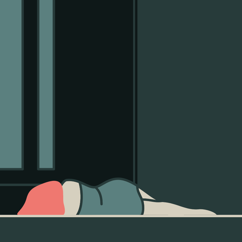
For the finishing touch a few small details were added to incorporate story elements from the film.


Wrapping Up
If you’re interested in the entire process from start to finish the video is available here.
Thanks for reading!