
Data Visualization in Illustrator
Overview: A practical Illustrator tutorial on turning raw data into beautiful, custom infographics using custom formulas, color wheels, timelines, dendrograms, and radar charts.
What you’ll learn
Communicating data in clever and beautiful ways helps an audience absorb information more easily. A well-planned data visualization will convey nuanced details, show trends, and quickly highlight relationships between facts and figures. This article covers various ways to work with data, bring that information into Illustrator, and create a beautiful data-focused poster.
The design prompt for this challenge is to gather data for any topic you find interesting and create a bespoke data visualization. I’ve included links for public data sets and other goodies to help inspire and get your very own data visualization project off the ground.
Concept: Disney’s Color of Evil
What is the color of evil? This project will use several chart/graph data visualization in Illustrator to show the relationship of Disney’s villains based on their color, “evilness,” and other trivia… called Disney’s Color of Evil [insert evil laugh here].
The primary graph will be focused on color using my study of Disney villain color palettes. Here is just a small sampling taken from my highly scientific research:
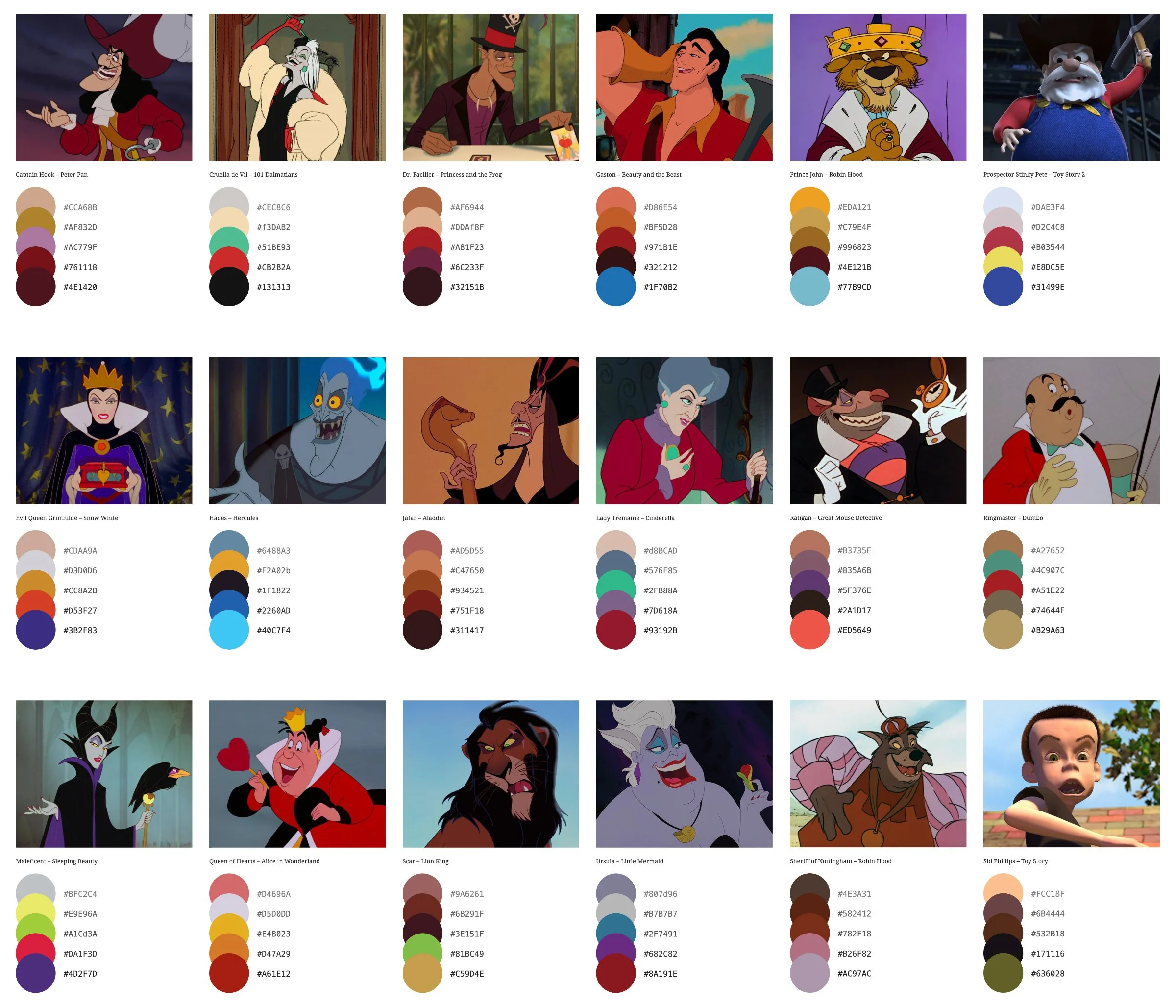
For the complete color palette set, see my article Disney's Color of Evil
A collection of color palettes taken from 60 Disney villains.
The finished data visualization will be a large color wheel infographic of sorts, with each villain plotted by their most representative color. Other points of data that might play a role in the final graphic include villainous acts, henchmen, year created, gender, species, and so on.
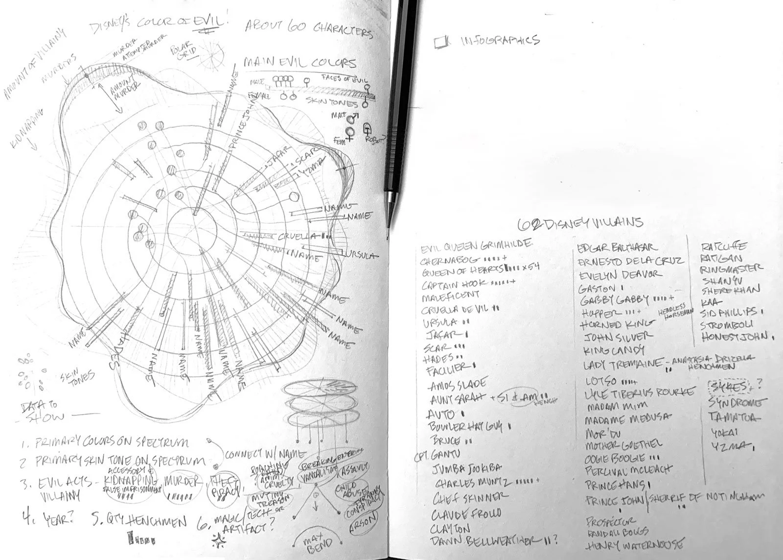
Rough notes on the initial color wheel layout, villain list, evil acts, etc.
The calculus of evil
The best data visualizations show relationships between several pieces of information. To make this more than simply plotting the character’s colors, I’m including data to help illustrate exactly how evil each character is.
A quick Bing search returns plenty of resources that cover the evil deeds of Disney villains, and the charges against them if they were to be tried in a US criminal court. These misdeeds will be used to measure what I’m calling the sum of all evil. The breakdown of the most prominent evil deeds among 60 Disney villains looks like this:
Guilty of assault or attempted murder
Of all the evil deeds, over 85% of Disney villains would be guilty of assault or attempted murder.
Guilty of conspiracy, tyranny, or terrorism
Over half the Disney villains secretly plot to overthrow those in power, and endeavor to rule with an oppressive fist.
Guilty of kidnapping
Hide your daughters, hide your wife! Kidnapping is even more popular than theft, piracy, and fraud.
But evil goes much deeper. The full spectrum of crimes include theft, piracy, fraud, abuse/child abuse, threats, harassment, mutiny, treason, imprisonment, slavery, murder, animal cruelty, trespassing, vandalism, arson, and many more.
Normalizing data for infographics
Once I had this information, I created a spreadsheet to keep track of everything. Some categories were very similar, so for the purposes of simplicity like-items are grouped together. Theft, piracy, and fraud are three distinct evil acts—though generally the same classification of crime. It wasn’t intended, but I ended up with 13 categories of evil deeds; which is a nice, evil amount.
Percent of evil deeds perpetrated by villains
A note on calculations: Evil acts perpetrated by villains are measured on whether the evil act has occurred in each category, and not the amount of occurrences. Once a murderer, always a murderer. I’m not counting how many times a villain un-alived someone—only that they did it. For the purposes of my dataset and calculating evil: one kidnapping, five kidnappings, or repeat-kidnappings will simply count as kidnapper=true for the villain.
Creating a calculation to measure villainy
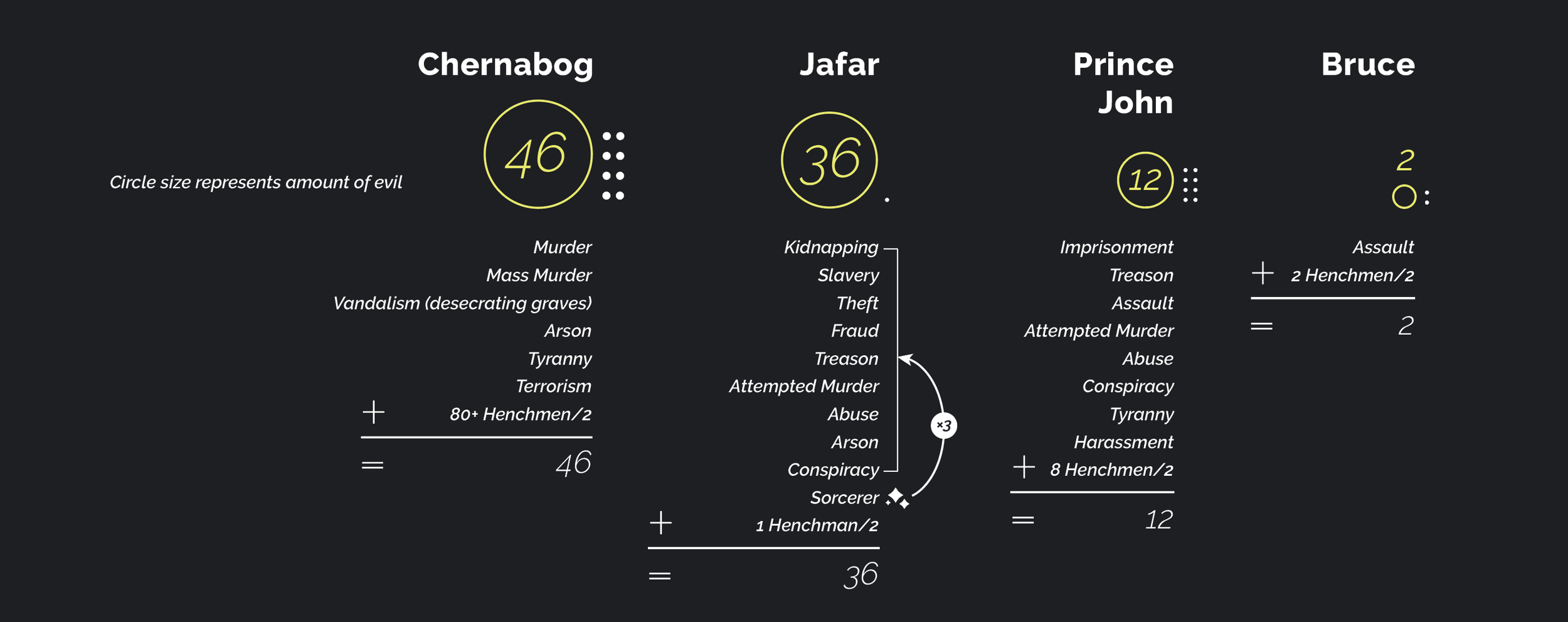
An interesting problem appeared; the raw numbers didn’t account for the maximum capacity of evil, only a flat, by-the-numbers crime value. Prince Hans is a nasty piece of work for sure, but is he really worse than Jafar? Not a chance. And what about weak villains with many capable henchmen? Prince John is pretty tame, but with 8+ henchmen he is far more formidable. These additional factors needed to be taken into account: sorcery and henchmen.
At last we arrive to my sum of all evil—a working formula to quantify each villain’s maximum capacity for doing ne’er well. This gives me properly scaled, comparable, measurable data points to craft my infographic.

Iconography started to take shape once I developed some more metrics. Magic is defined with little stars and henchmen with dots.
Magic elevates a villain’s power to incredible heights, and henchmen are, well, usually simple-minded goons. After a lot of trial and error I found a reasonable balance of adding the product of evil acts ×3 and henchmen/2 (rounded down). A cursory search of ‘Disney villains ranked’ on various message boards shows a general consensus that reinforces the accuracy of my formula.
Data visualization calculations
Here are some examples of the sum of all evil calculations applied to various villains:
The magic factor
Bibbidi bobbidi abomination! Magic is neither good nor evil, but rather is defined by its use—benevolent sorcery, fairy godmothers, divine powers of an Olympian god, levitation, magical artifacts, powerful charms, sleeping potions, summoning minions, or transforming into a dragon to name a few. Magic boosts the capabilities of the villain and often plays a key role in the execution of their evil plans.
The henchmen factor
Hiss! You’re never around when I need you! Henchmen serve as informants, snitches, and muscle, slightly increasing the reach and relative power of the primary antagonist. However, the doofus nature of henchmen guarantees they are only marginally effective at any task. The calculation above considers this by taking the quantity of henchmen, dividing in half and rounding down. So a single henchman is valued at 0.5 which rounds down to 0 (no benefit—sorry Jafar/Iago and Gaston/LeFou). But 8 henchmen will give Prince John a +4 point boost in evil power.
The D.I.M. – distribution of intelligence measurement
Now listen, you idiots! All henchmen share a common pool of intelligence which I lovingly call the “DIM” (Distribution of Intelligence Measurement). The DIM is an intelligence theory asserting that most henchmen share a single pool of knowledge that is equally distributed among them; the more henchmen, the less individual intelligence each possess.
For example: 1 henchman will contain 100% of the available intelligence pool (smart, but usually less than the primary villain; e.g. Jafar and Iago), 2 henchmen will each have 50% of the total intelligence (kind of dumb e.g. Hades’ Pain and Panic, Cruella’s Horace and Jasper), 3 henchmen will share 33%, 10 will each only have 10%, 80 henchmen are simply mindless chaos agents incapable of thinking, and so on. Occasionally this value is skewed to give more intelligence to the primary henchman (and less to the rest). But as a rule of thumb, the more henchmen one commands, the dumber each will be overall.
Evil, color coded and visualized
With the dataset complete, I now have enough information to build a solid data visualization, and can finally dig into constructing the actual charts and graphs.
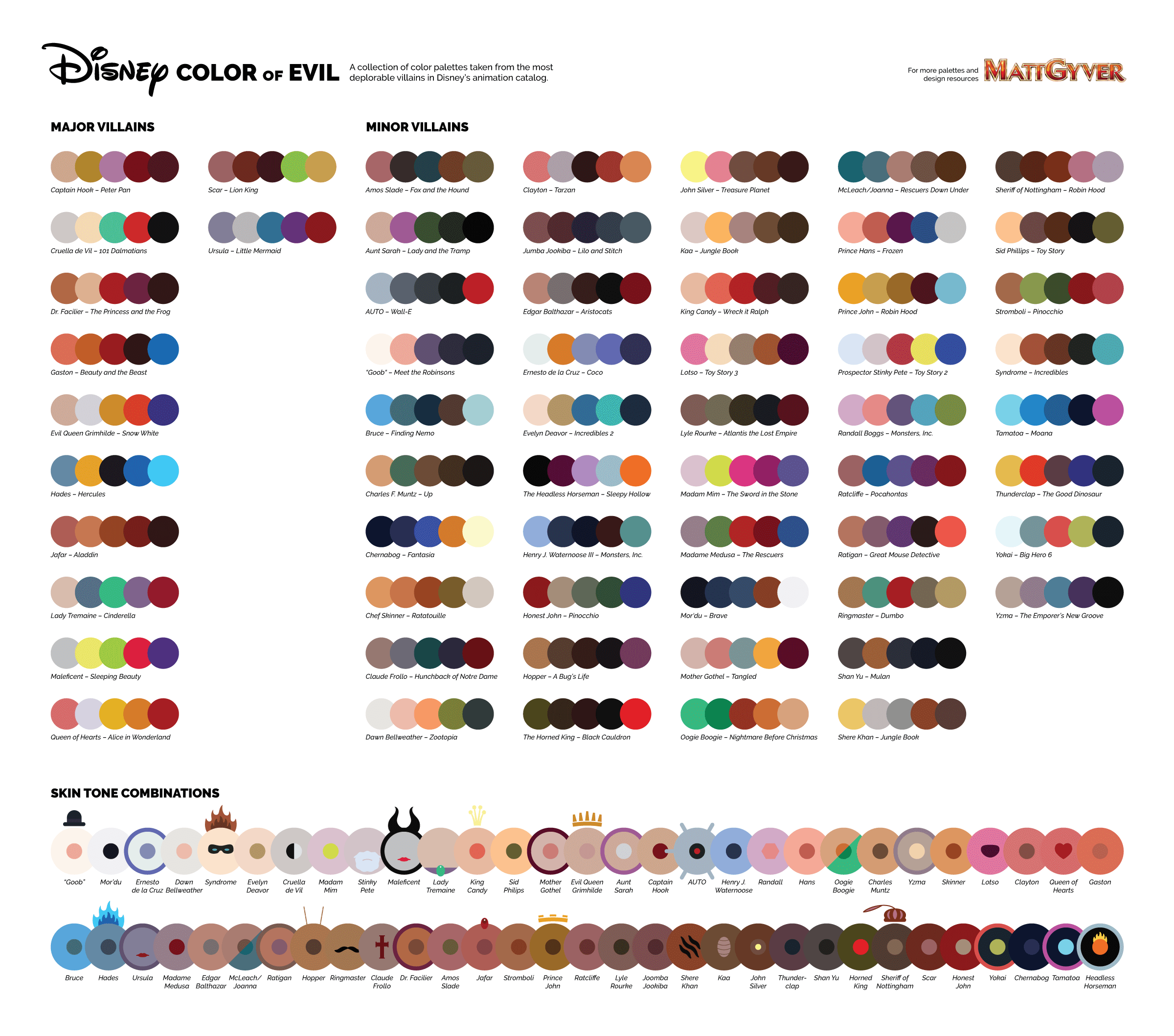
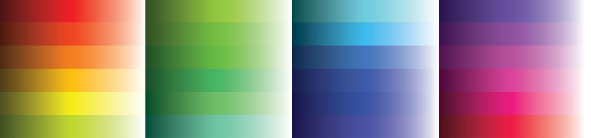
First up will be the primary color wheel infographic. With several ways to construct a color wheel, I decided on a stylistic approach consisting of 24 leaves, each of which has a gradient hue 15º different from its neighbor. The leaves overlap with a transparency and should fade into the dark background.

Each villain is placed around the wheel according to their main color. I originally wanted to use skin tone combinations, but ultimately went with their dominant clothing color; it’s a more meaningful representation of a character’s choice in how they project their evil self-image to others.
The color wheel itself had to be altered to work better on a black background and each villain tended to be a darker hue, so this new arrangement helped spread the distribution around the radius:
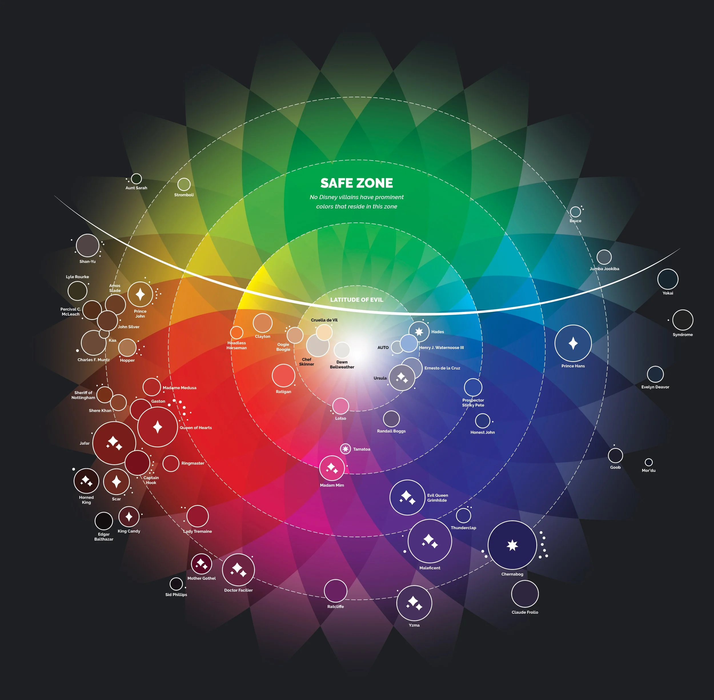
Iconography and visual variety
The information gathered from the sum of all evil calculations shows the relative power of each villain as the size of their circle, their henchmen as small dots in close orbit around them, and icons to indicate sorcery, royalty, and immortal/god-like status—these help to identify more unique characters in the sea of villains.
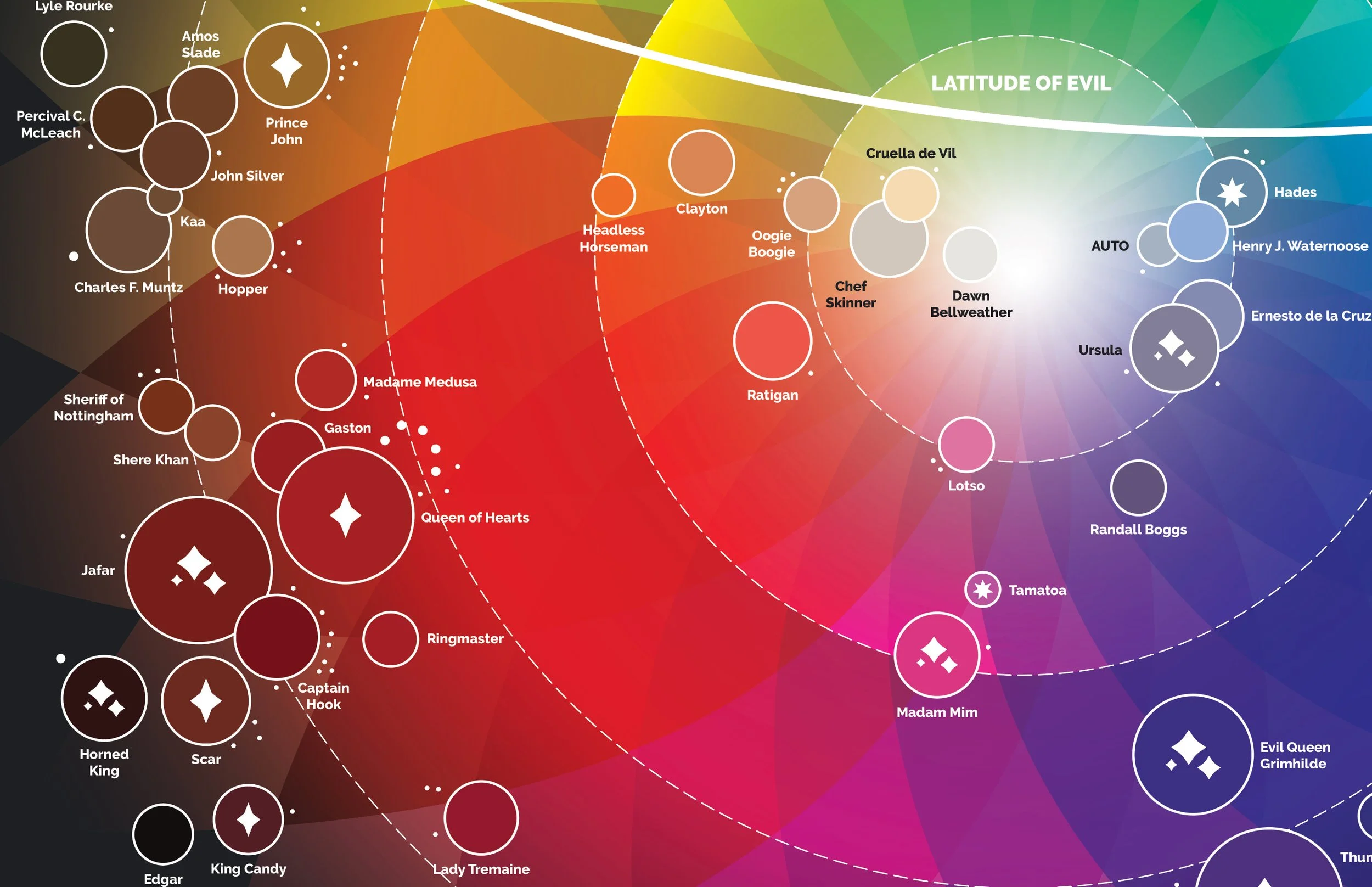
What I learned
A trend appeared—most Disney villains were placed in red-purple-blue regions, with nobody in the green spectrum. I call this separation of evil colors vs. non-evil colors the latitude of evil. It could even be tightened up more to exclude the four villains residing in that region, but those villains are fairly tame, and maybe simply misunderstood when compared to the rest.
Plotting the timeline of evil
Now that I’ve established a visual language to represent each villain, we can start plotting them into various infographic arrangements. Here’s a a simple timeline data visualization to explore how Disney villains appear over time, plotted according to when their film was released.
The timeline itself is nothing more than an evenly-spaced dotted line with the dashes and gaps adjusted so each mark indicates a year from 1930 to 2020. Larger marks were placed every 5 years to help viewers skim the data.
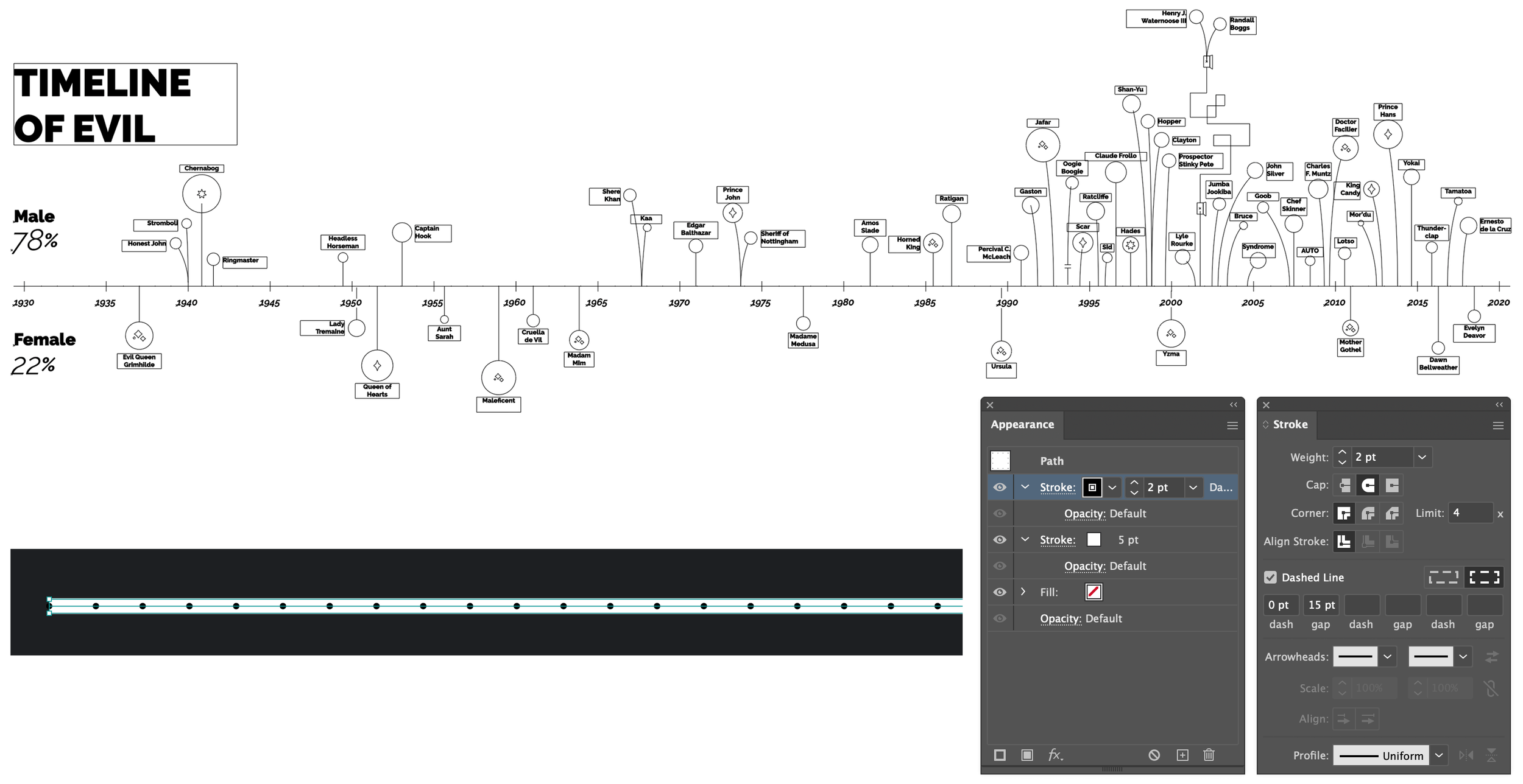
What I learned
Despite the age difference in films, Disney really did have some big-bads back in the day, with a more even distribution of male (11) vs. female (8) before 1980, four of which are quite strong. Modern villains by comparison seem to be more subtle and nuanced in their endeavors… and overwhelmingly male. Seeing trends appear in data is what makes data visualizations compelling and beautiful.

The timeline gets crowded in the modern era so it became a puzzle trying to fit everything. So many male villains!
Custom data visualization charts
With two charts done, it’s time to start plotting data with the assistance of charting tools. I like to use a free tool called RAWGraphs. It does most of the work, and the charts it creates can be downloaded as Illustrator-friendly SVG files. Behold the possibilities!
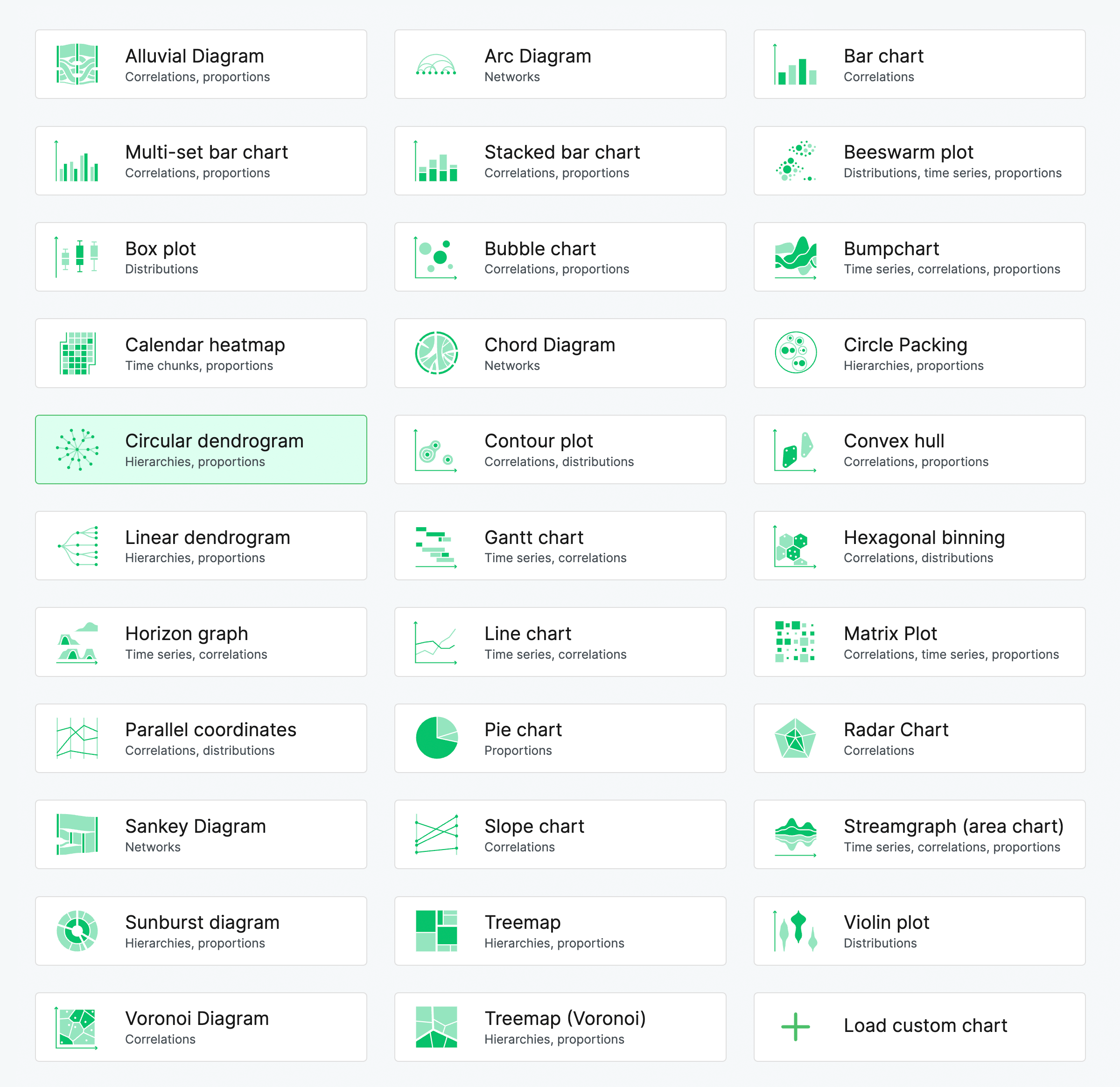
A vast array of free chart and graphing tools are available at RAWGraphs.
I’m fond of beautiful circular graphs like dendrograms and chord diagrams and such, so let’s take the villain data and make a circular dendrogram—it’s a hierarchy tree that expands outward. Because I have info on each villain’s species and classification, this could easily be some kind of circular taxonomy chart.
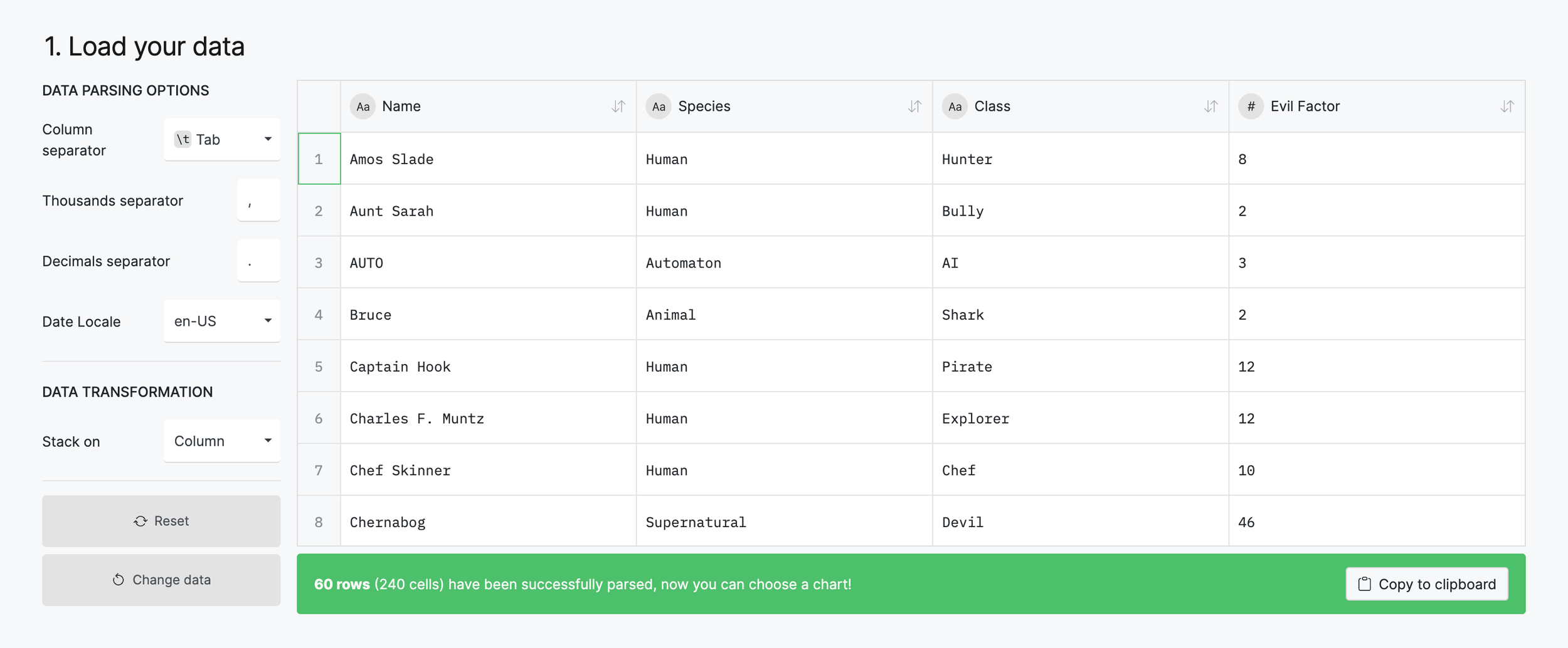
Step 1: RAWgraphs data setup
For step 1, copy/paste the columns of data that you want to use into the available space. I usually have to make adjustments for things like empty cells and headers. Here’s how my data looks pasted into RAWGraphs.
Step 2: RAWgraphs chart mapping
Once the data is in and the type of chart selected in (circular dendrogram from step 2), begin mapping which pieces of data will be used for each part of the chart in step 3. It’s a drag and drop affair, and once the chart has enough variables defined, you’ll see the chart build itself in real-time.
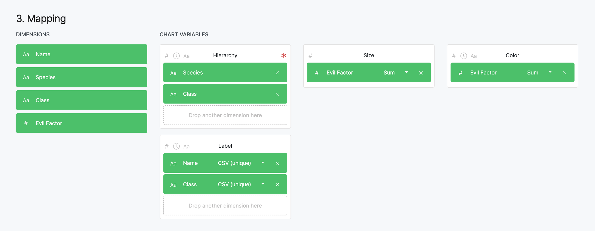
Map the dimensions of data to the various parts of the chart. Move them around until you're happy with the results.
Step 3: RAWgraphs chart output & export
After some adjustments to the settings, colors, and formatting, my circular dendrogram looks nice and organized. Every villain is sorted by classification first, then by species. The villains’ circle sizes are determined by the sum of all evil like the previous charts, and labeled accordingly.
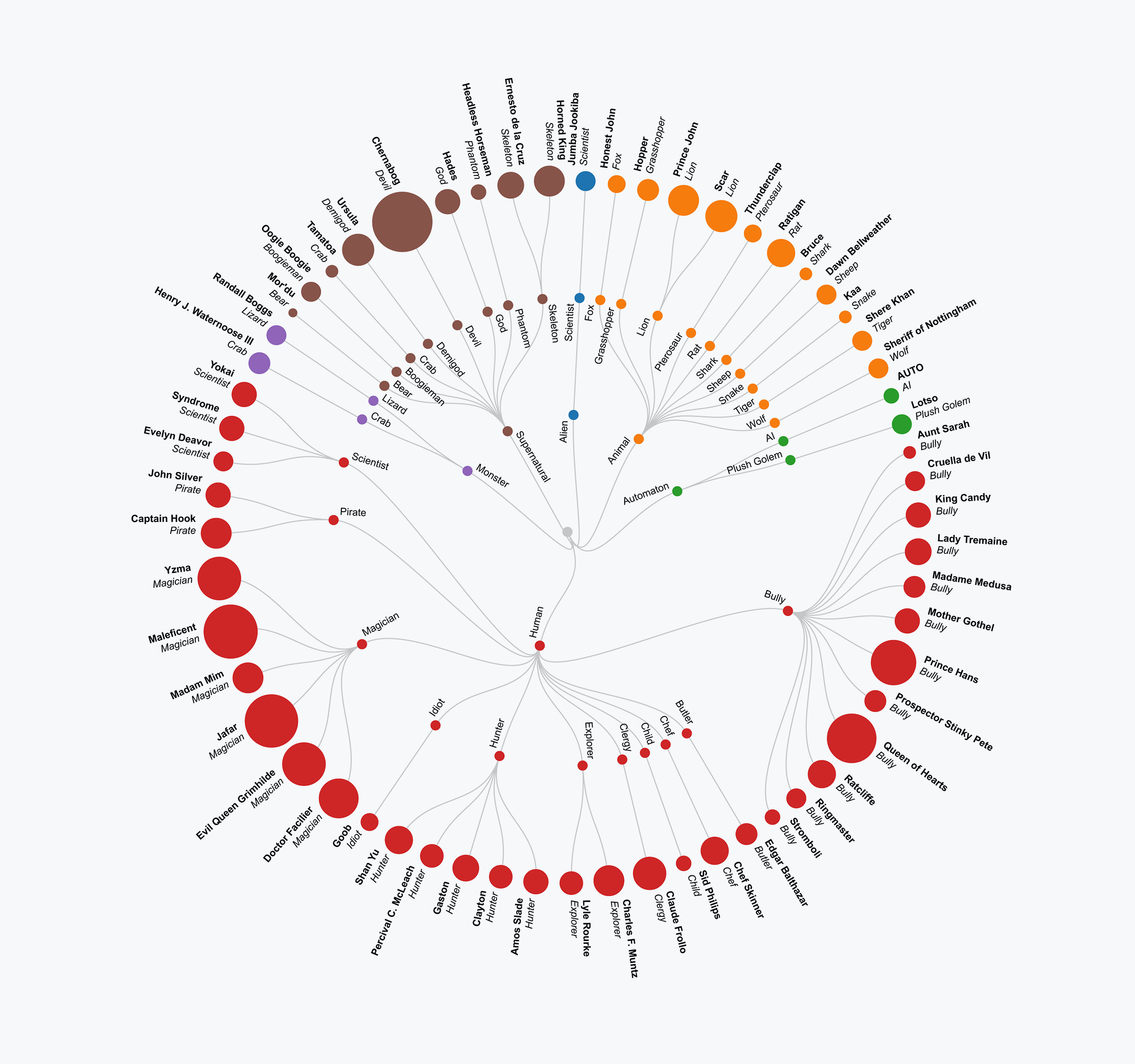
The original dendrogram from RAWGraphs saved as an SVG and opened in Illustrator.
The colors still need to be changed to match the actual villain palette, and there are several other minor adjustments to make, but this is a fantastic start.
Step 4: Import the chart into Illustrator
Save it as an SVG (button at the bottom of the RAWGraphs page) and open the file in Illustrator.
Once in Illustrator I centered the text next to each villain, incorporated some icons to define sorcery/royalty/immortality, thickened the line work, removed redundant classifications on branches, and modified the labels. My finished graph looks like this:
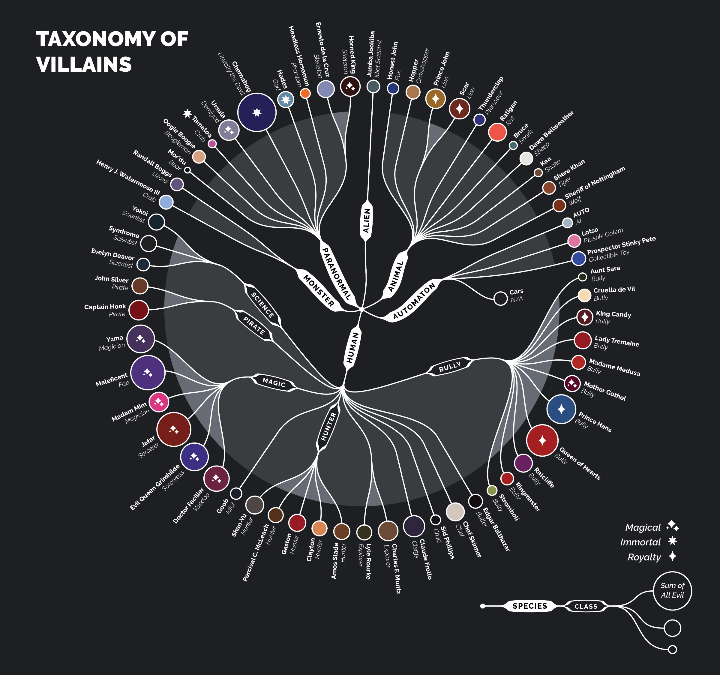
A taxonomy of Disney villains laid out as a circular dendrogram.
A few more bits of data emerged here. Over half the villains were human-like (I thought there were fewer), only a third of them had animal sidekicks (I thought there were more), and there are far fewer animals as the primary antagonist than I remember (I thought there were far more animal-centric movies).
Human villains
The majority of Disney’s villains are represented by humans, proving the most dangerous animal is... man.
Animal sidekicks
Of the 33 human villains, only 11 have animal sidekicks e.g. Jafar and Iago, Maleficent and her raven Diablo, etc.
Animal villains
A distant second place are animal villains as the main antagonist e.g. Scar, Shere Khan, Prince John, etc.
One more chart, why not a radar graph
Let’s do one more chart for good luck—a simple radar graph showing the correlation of evil acts collectively perpetrated by the villains. This one can be done directly in Illustrator using the built-in tools. It’s a standard spreadsheet-style data entry—nothing spectacular—and you’ll need to Object > Expand the results to style it properly.
Here are my initial data points and the radar graph they created.
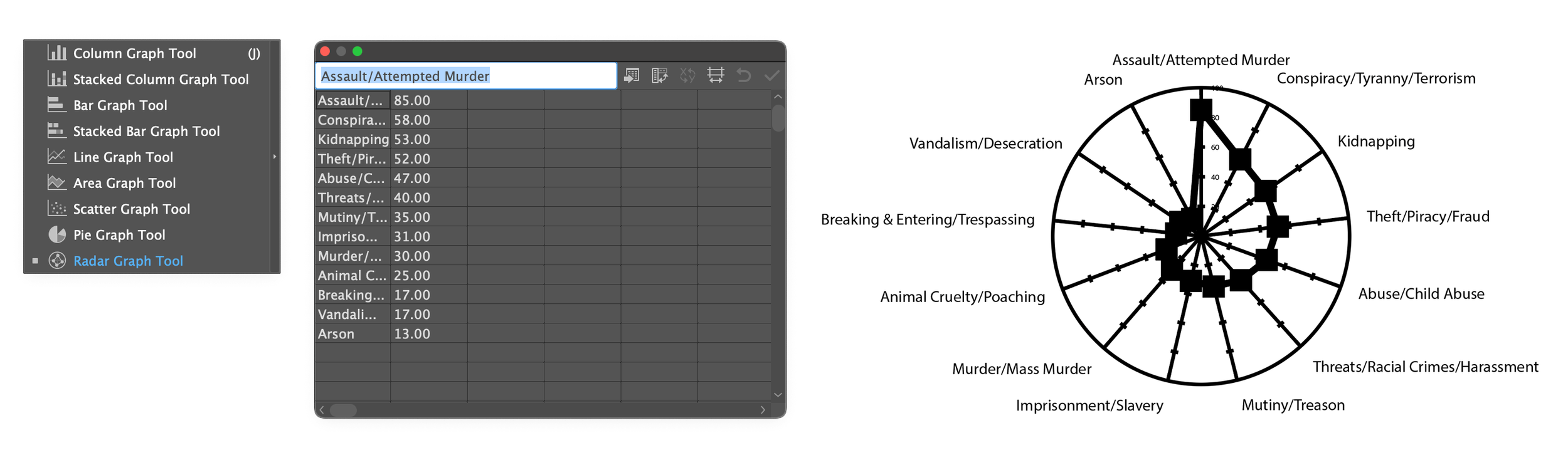
Radar graph setup in Illustrator
Adobe has a thorough article on using the graphing tools in Illustrator. The charting isn’t very pretty, nor is it very feature-rich, so expect to manipulate everything on your own. It’s not too terrible, but I usually just use the graphing tools as guides to help me place my own data/illustrations with more precision.
Here’s the final radar graph showing the distribution of evil acts.

A radar graph showing the distribution of evil acts. Each shaded circular track/dotted line represents 25% increments.
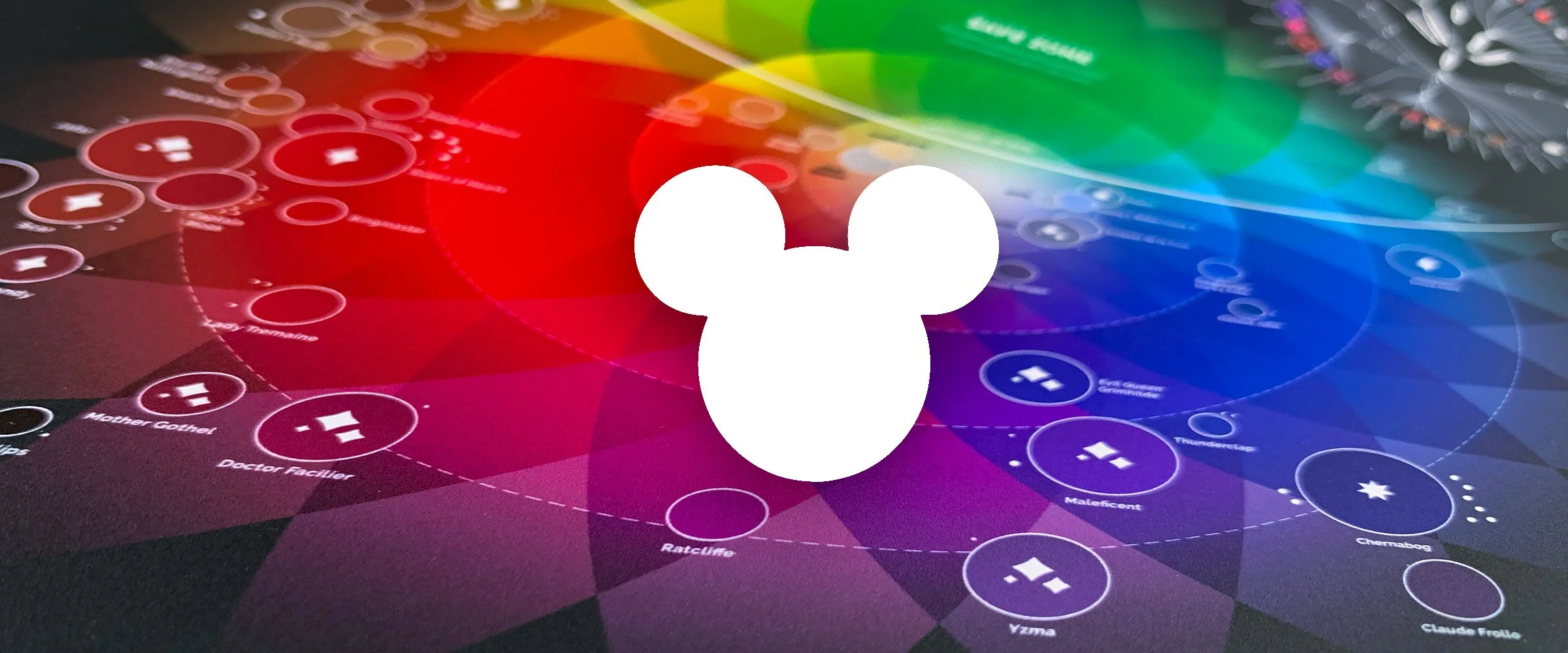
The Color of Evil infographic
With all the charts and graphs complete, the final form of the project takes shape: a big hidden Mickey! Using the research data and flavor copy I gathered over the course of this project I filled out the rest of the infographic with interesting facts and other details.
Wrapping Up
Thanks for reading! Data visualization projects like this are incredibly fun, and the tools and methods can be applied to just about anything that has measurable data—and things that aren’t—like my subjective color study. Don’t feel limited to Illustrator and RAWGraphs either, anything that can create a chart will work. You want to use Figma and Excel? Go for it you impetuous maniac!
If you’d like a really nice print of this project it’s available as a poster in my store. No Disney logos were used in the creation of this legally-distinct-from-a-Disney-created-product product 😉, though it certainly got some scrutiny from my printer.
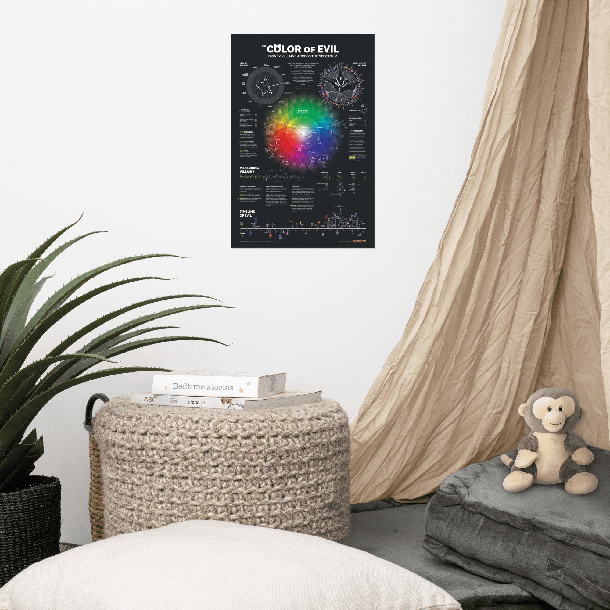
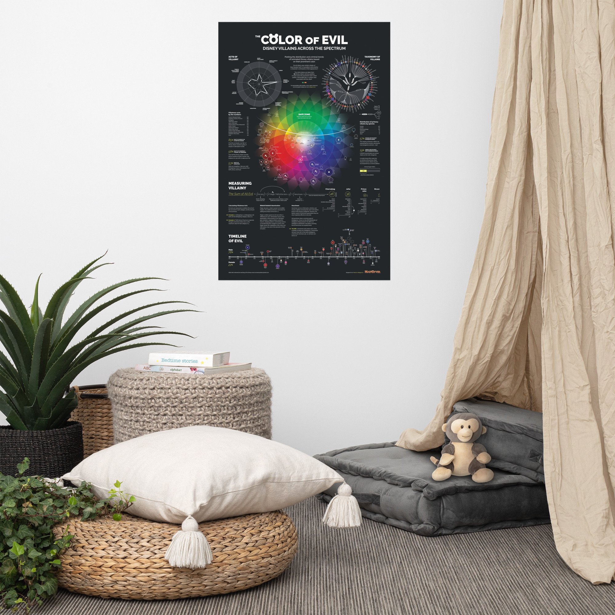

Do all Disney villains wear sinister shades of blue/purple/red? Is it possible to tell whether a character is evil based on their appearance? This lovingly crafted data visualization plots the criminal trends of Disney’s animated cast of deplorables by color palette, evil deeds, classification, and timeline.
For free downloadable Disney villain color swatches and screen capture references, check out the companion Color of Evil article.
• Paper thickness: 10.3 mil
• Paper weight: 5.57 oz/y² (189 g/m²)
• Giclée printing quality
• Opacity: 94%
• ISO brightness: 104%
Additional Resources
To continue on the journey of making beautiful infographics, here are a few more inspirational links for some of my favorite data viz projects and resources to get the creative juices flowing.
Dataviz Inspiration | Hundreds of chart examples (dataviz-inspiration.com)
Data Viz Project | Collection of data visualizations to get inspired and find the right type
Showcase — Information is Beautiful Awards
How to get started with data visualization - Datawrapper Blog (great fundamentals)
Behance data visualization projects
Need Data?
If you aren’t sure what to do, start with a great set of data and see what you can make. Here are a couple free data resources.