Longleaf Home Branding
Overview
Longleaf Home is a remodeling, repair, and custom carpentry shop in the Charlotte area specializing in kitchens, baths, living spaces, and bedrooms. Although the company is new, the folks at Longleaf have years of experience to give homes the love they deserve.
The branding for Longleaf Home speaks to the precision of custom woodwork while invoking imagery of the titular longleaf pine – an iconic tree of the Southeastern US and coastal plain.
Typography & Logo Sketches
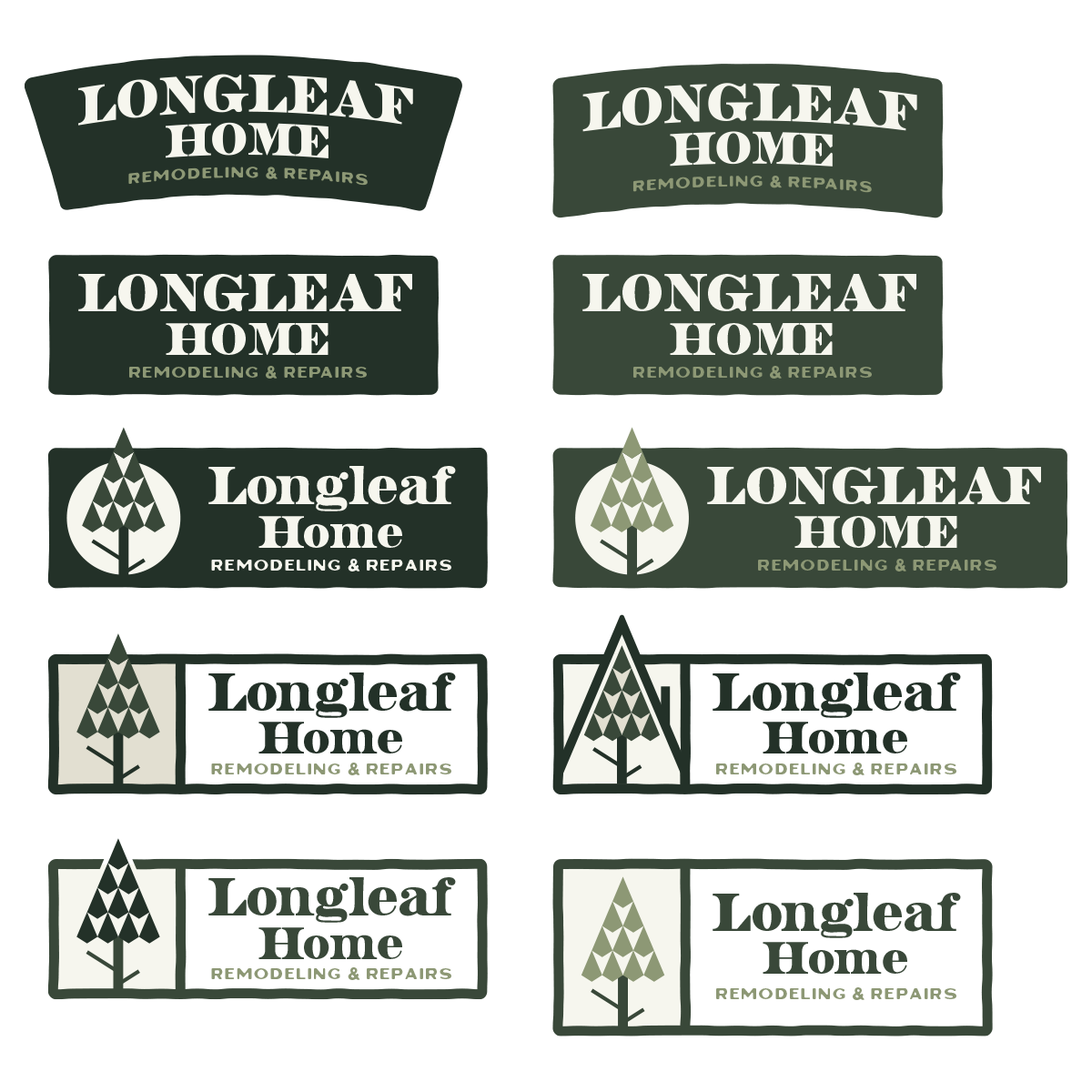
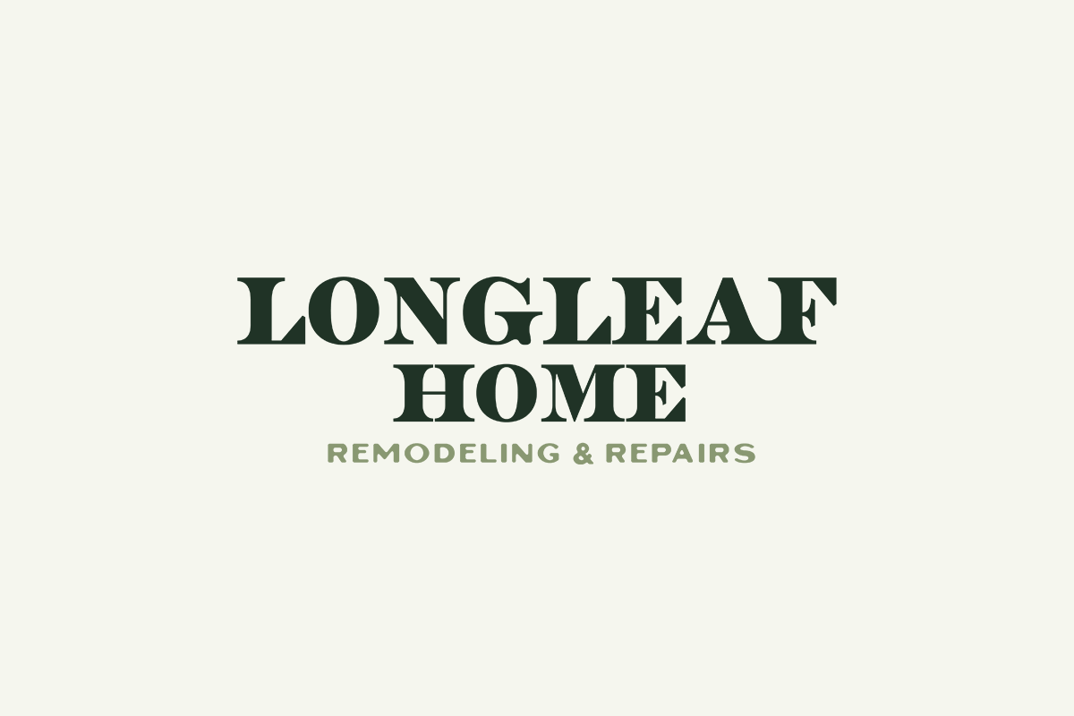
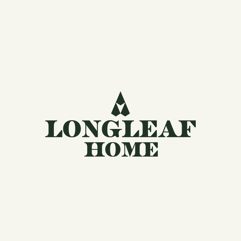
The logotype needed to feel precise, yet clean and familiar. A large badge will be used for most applications, but the logo should reduce cleanly across multiple applications and still be recognizable as Longleaf Home – in typography, color, and stylings.
Early concepts incorporated a longleaf pine into the mark, playing off the height and skinny composition to make something architectural, maybe slightly outdoorsy.
Logo Explorations
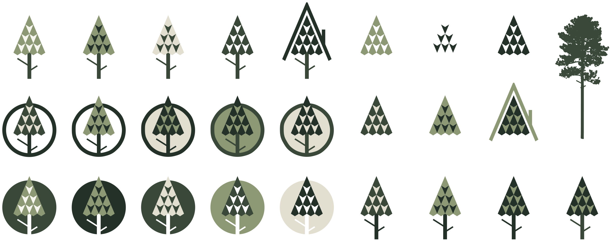
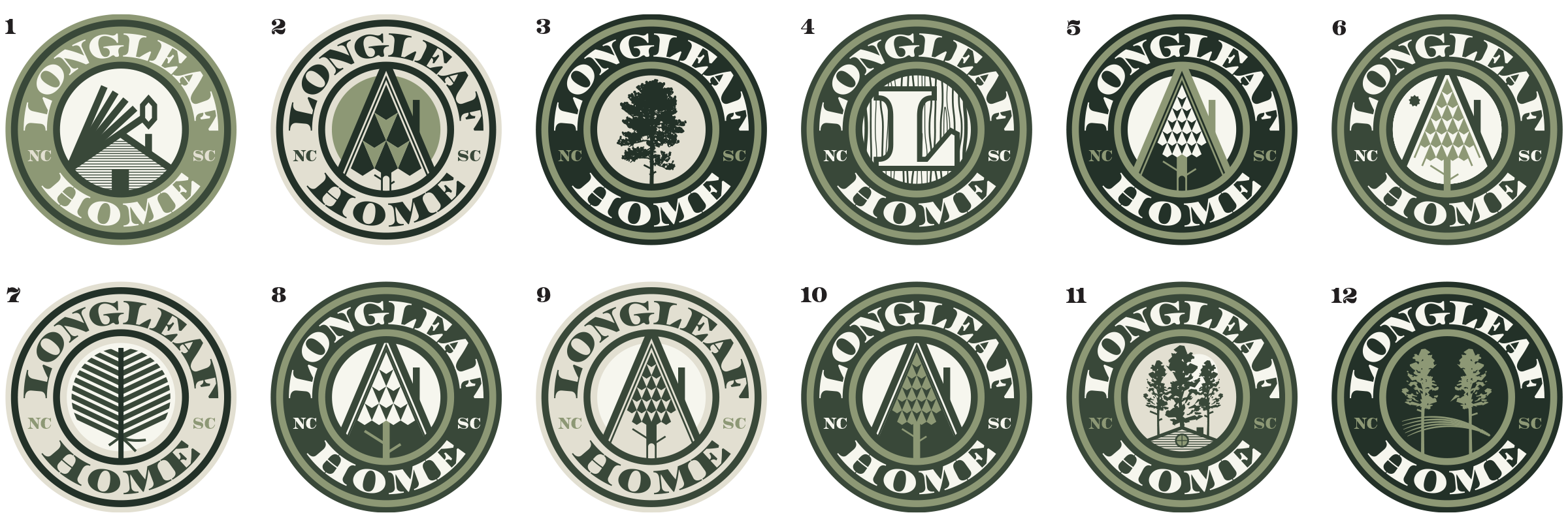
Plenty of compositions were illustrated with special attention given to the mark itself. Complexities of a real tree were reduced to simpler geometric forms.
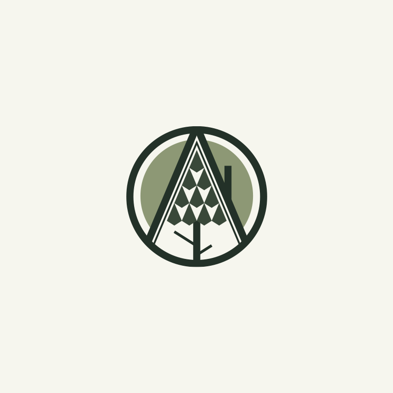
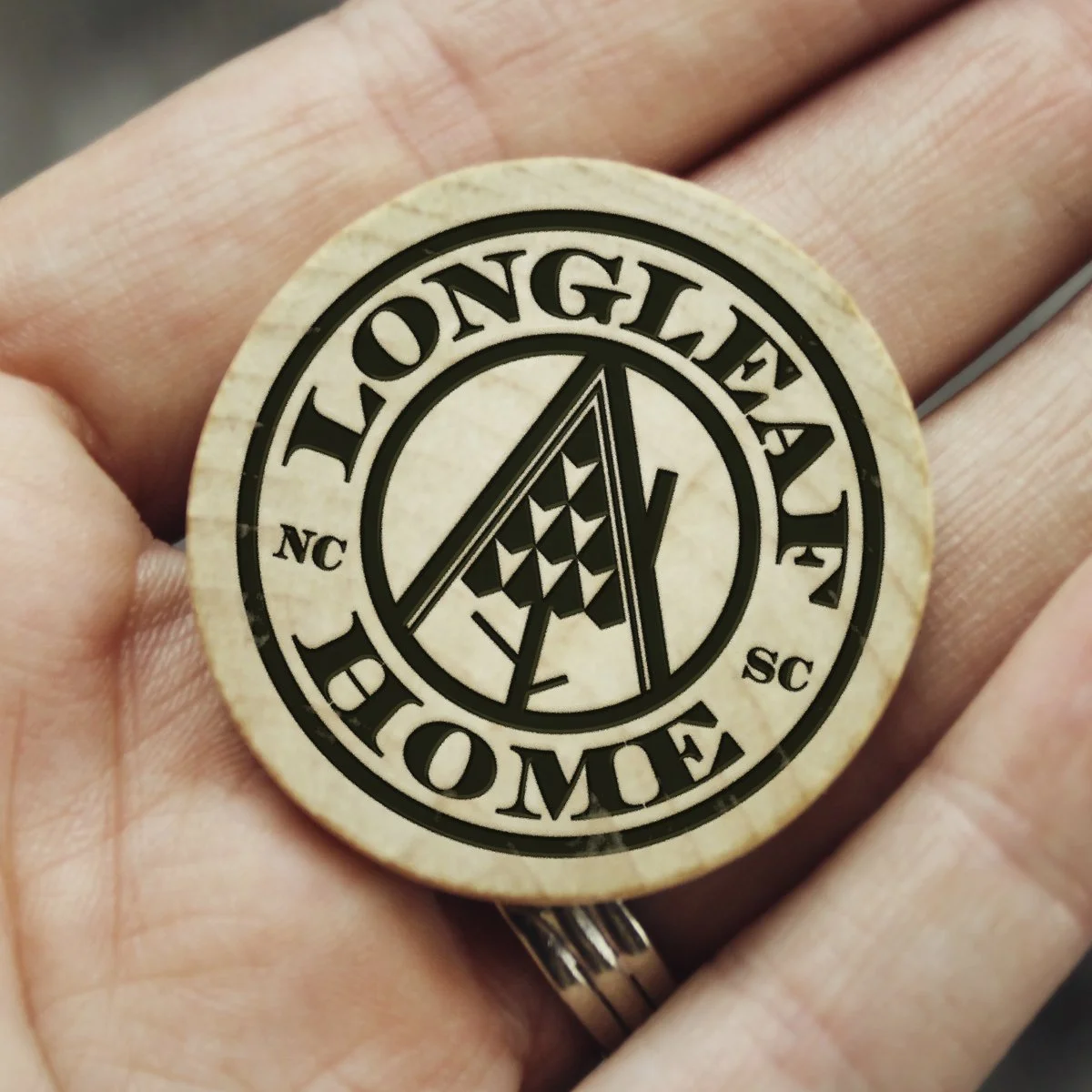
The final mark reinforces ‘home’ with a stylistic A-frame as part of the badge.
A selection of the more refined elements and pieces from the Longleaf Home process.
Final Logos
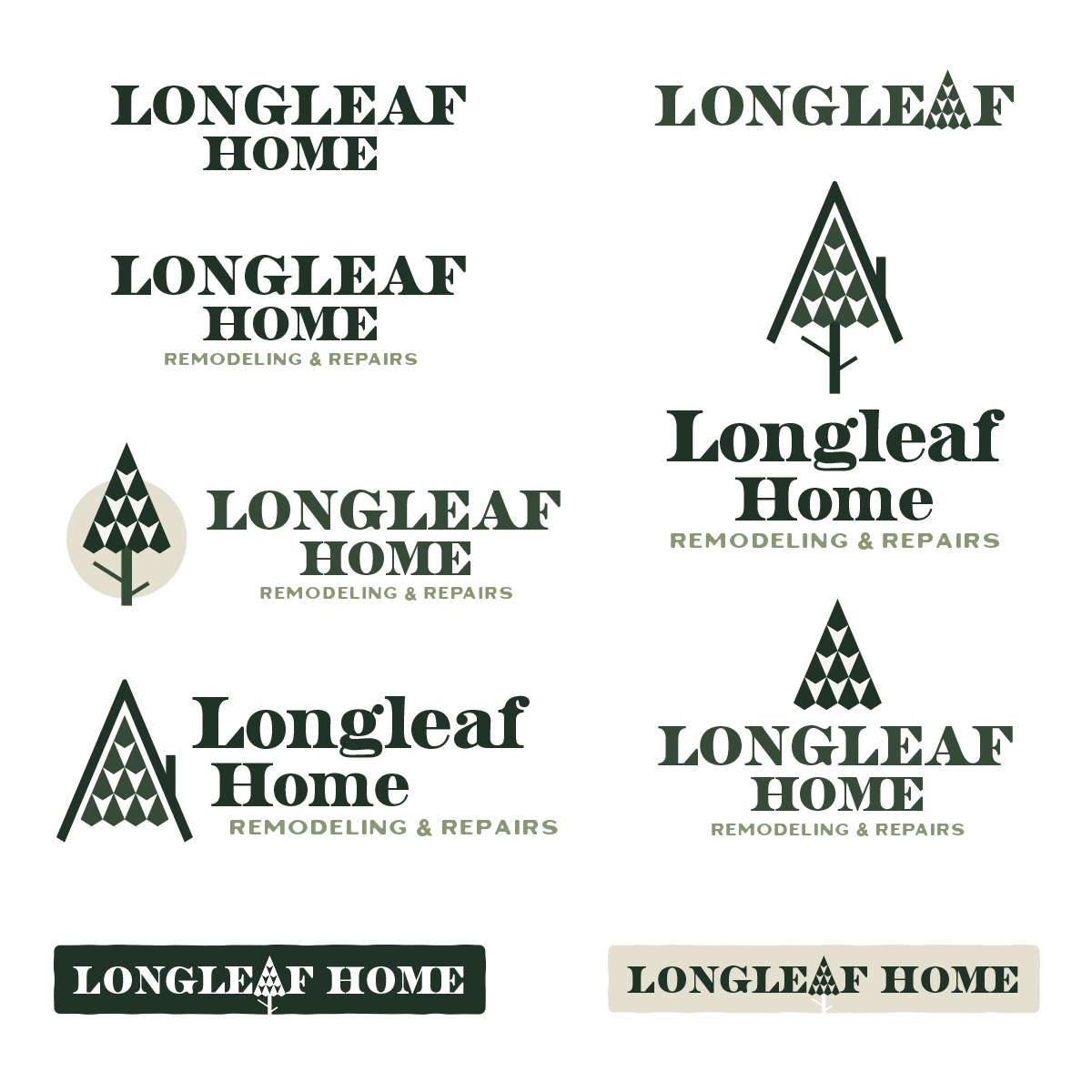
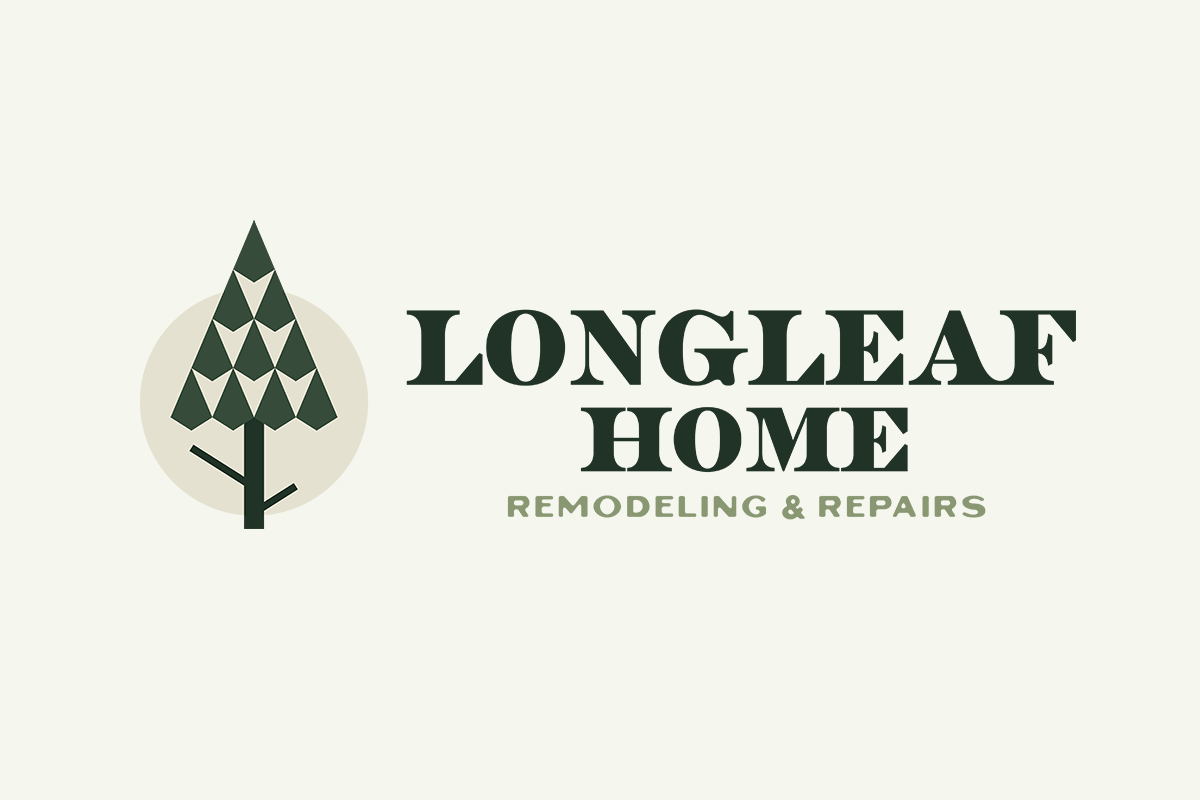
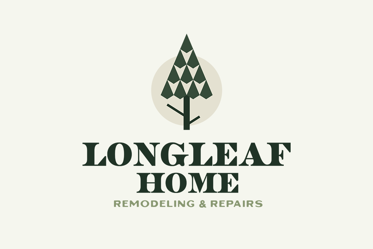
The completed badge can be deconstructed back into its original form, and even paired with the logotype in an abbreviated form.
Brand Building
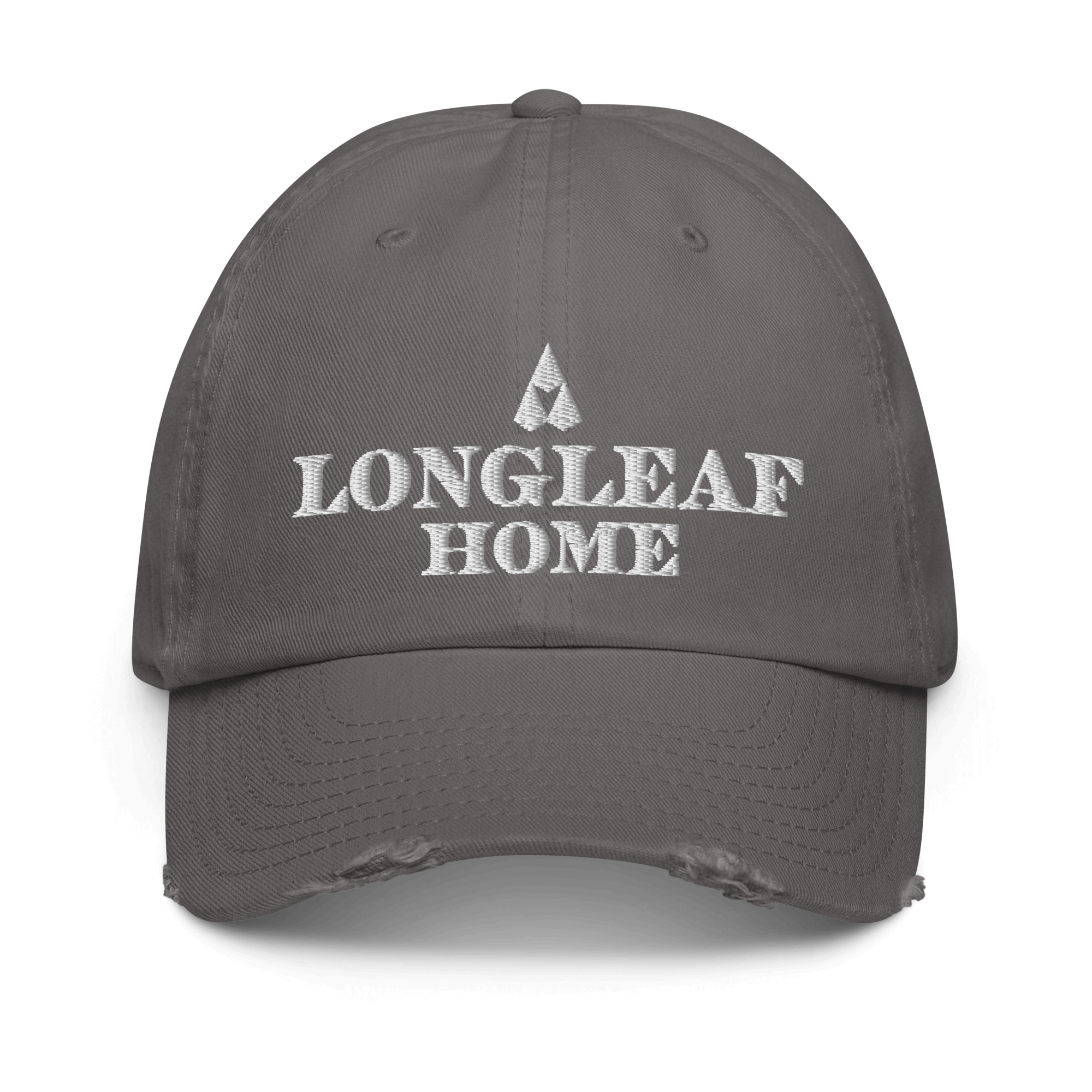
In addition to standard logo wear and collateral, the business card is a bit more unconventional: a double-sided wooden nickel. Logo/badge on one side, contact info on the other – it’s a nice handmade touch to highlight the carpentry and craftsmanship.
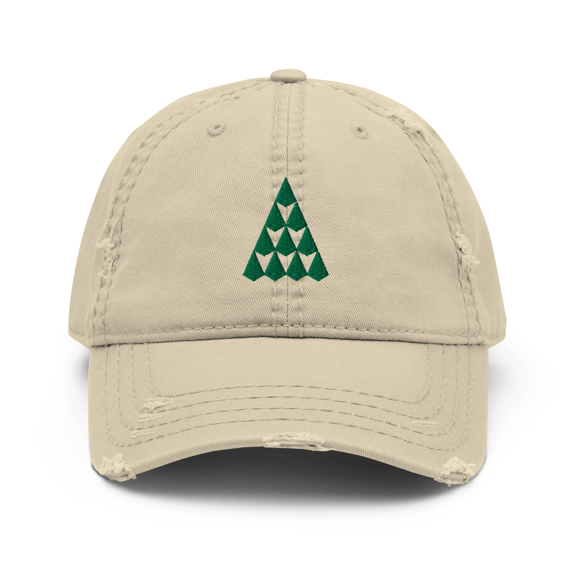
Embroidered polo top casual work wear
Recycled shirts made with environmentally friendly organic cotton
Wrapping Up
Geometric simplicity has always been a love for me. The nature × home motif work well together and allow lots of flexibility across many applications. Excited to see where this goes in the future. Thanks for reading!

