Illustrator Knots
Overview
Woven knots have always been a fascinating subject — they are symbolic and mathematically clever… and tricky to create. This tutorial will break down the process of creating a loosely woven knot graphic (Celtic knot, braid, etc.) in Illustrator.
Knot pattern Inspiration
The inspiration for these particular knot illustrations come from mathematical knot theory.
Imagine a string, twisted and tied back on itself, creating a woven loop with no beginning or end. These patterns are common motifs in Celtic art (such as the Book of Kells), Tibetan Buddhism, ancient Chinese knotting, Norse culture, and well, most of the architecture from the Lord of the Rings — Dwarves, Elves, and others.
Here is a small sampling of the hundreds of such knots. The numbering below each figure is a reference system that indicates how many times the knot crosses over itself and its order in the group. These are all knots with 9 overlaps.
Knot topology courtesy of http://katlas.org/wiki/The_Rolfsen_Knot_Table
1. Getting Started
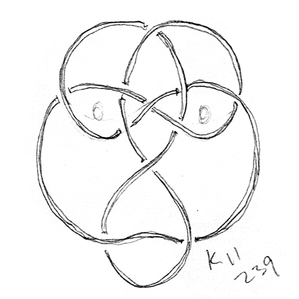
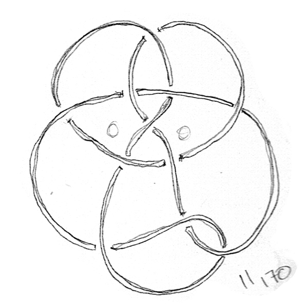
Rather than simply aping the above knots, I’d like to inject a little personality into each finished piece. Referencing the knot atlas I settled on a few of these 11-crossing knots that look a lot like apes. So in a way we are aping the knots 😜. Here are a few sketches to get things started. Be sure to note where lines cross over and under each other.
Orangutan
Bonobo
Gorilla
2. Vector Lines & Symmetry
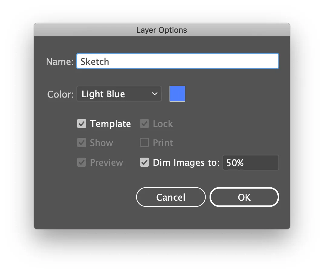
Drop your sketch into a new Illustrator layer and set the layer to a template (double click the layer to open the dialog). This will allow you to go into View > Outline mode and still see the drawing underneath.
Double-clicking a layer will bring up its options dialog. Set the layer as a Template layer.
Create a new layer on top of that one. We’ll be building our lines on top of the sketch.
Using as few points as possible for maximum smoothness, use the Pen tool to create a single continuous line that closely matches the sketch.
If your design is symmetrical, sometimes it’s easier to simply create half of the line work and use a Distort & Transform mirror image effect to build the symmetrical shape. Be sure to group your lines together when applying the Reflect X effect.
The Transform tools can do a lot more than simply creating a mirror image. Experiment with radial symmetries and more.
Once the overall shape feels finished and smooth, Object > Expand Appearance on the mirror image effect (only if you used it of course). The entire art should now be lines.
To finish the line work, do a cleanup pass and join (Ctrl+J or ⌘+J) any loose end points. They will need to overlap exactly on top of each other before the join will work. Smart guides make this easy, or alternatively select both points and Object > Path > Average (Ctrl+Alt+J or ⌘+⌥+J). That will move both points to the exact same location somewhere between each other; they can now be joined.
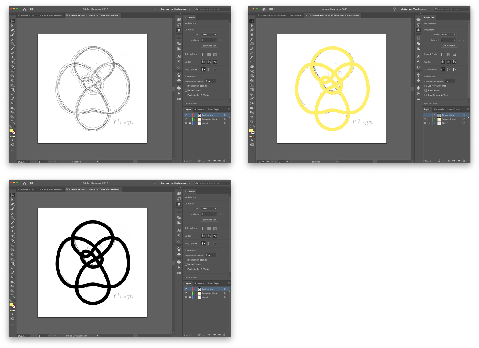
Now create a new layer on top to hold a copy of the original line work. Select the finished line art and copy it, then paste in front (Ctrl+F or ⌘+F) on the new layer. It’s important for the lines to be in the exact same spot on both layers, because we’ll come back often to grab line segments. Hide this backup layer to get it out of the way for now.
Once the backup layer is hidden, Object > Expand Appearance on your working lines so they are a solid filled shape.
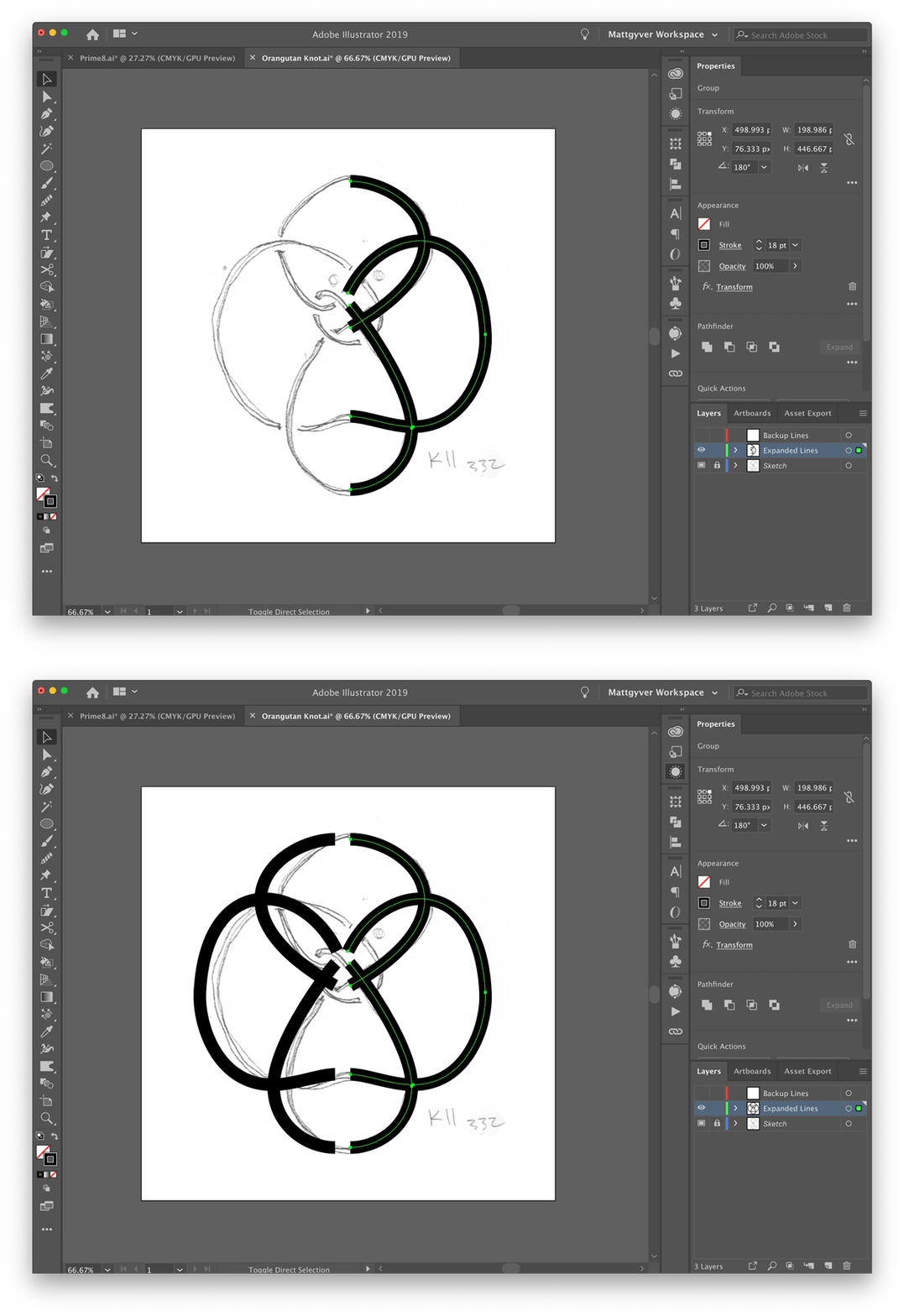
Seen here are both line layers; the expanded lines, the backup original lines, and outline mode showing how everything is aligned exactly on top of the sketch.
3. Setting up the Mask
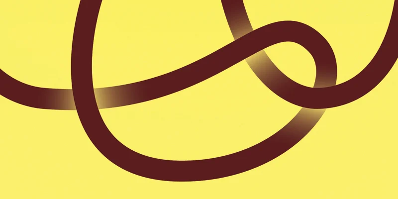
We’ll be using transparency masks to create the woven pattern. By using masks with varying levels of transparency (gradients) we can fade sections of the line art to make it look like a woven ribbon.
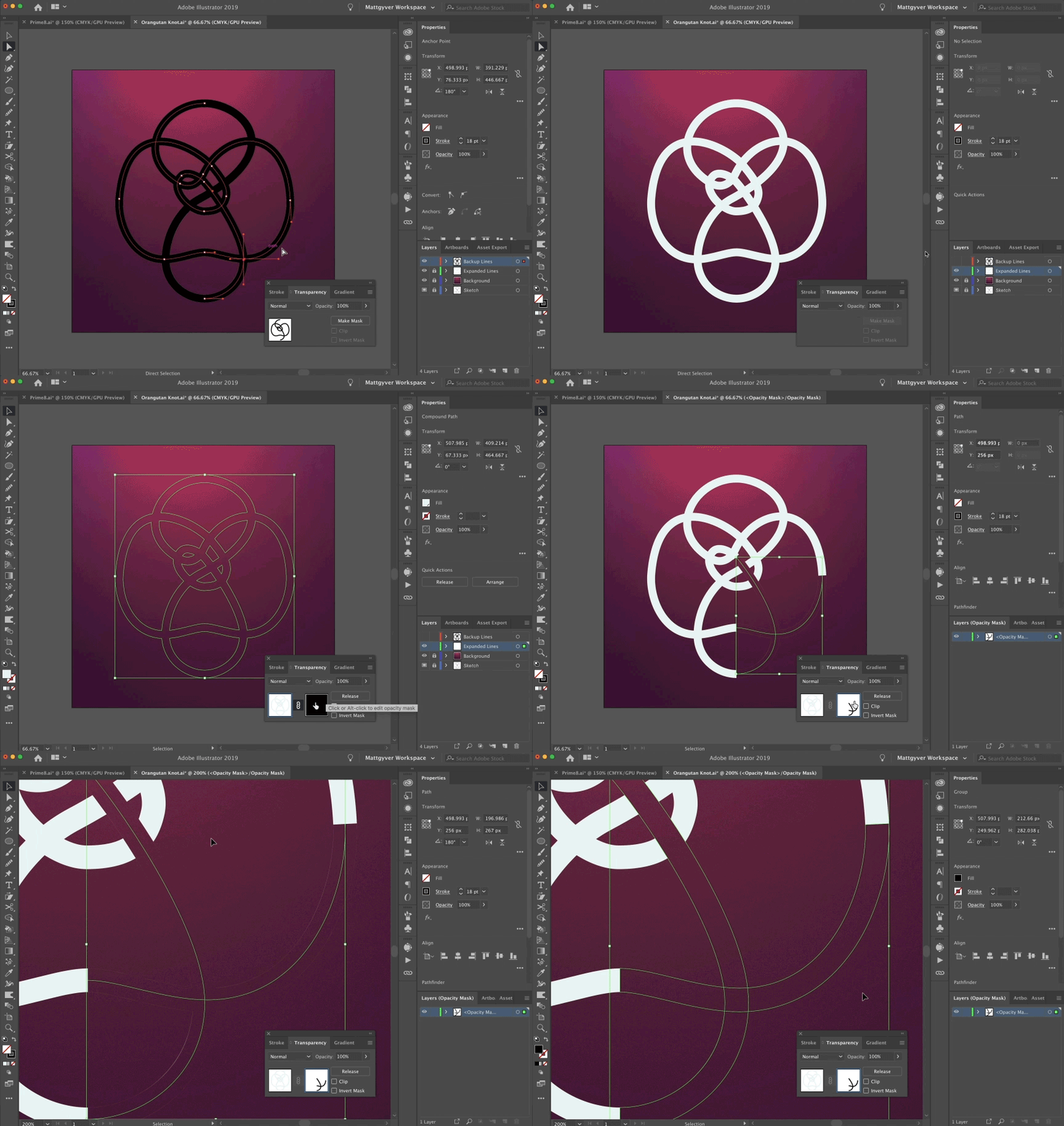
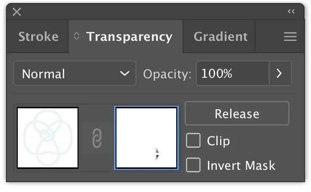
Select your expanded knot shape and open the Transparency panel. Click the Make Mask button. Your artwork will vanish under the newly created mask so uncheck Clip. This reverses the masking to make the artwork visible again.
Because the woven effect will be gradient transparencies placed along the line, working with lighter art on a dark background will look more natural. The line color and background can easily be changed any time, so experiment a bit. Let’s add a new background layer at this point with a darker color than the line.
Looks a bit strange on a light background.
The transparency looks more natural when used on a darker background.
4. Masking and Overlapping
So here’s the meat of this tutorial — to make the overlapping lines, unhide the top line layer from earlier and copy two intersecting line segments. Go ahead and hide the layer again.
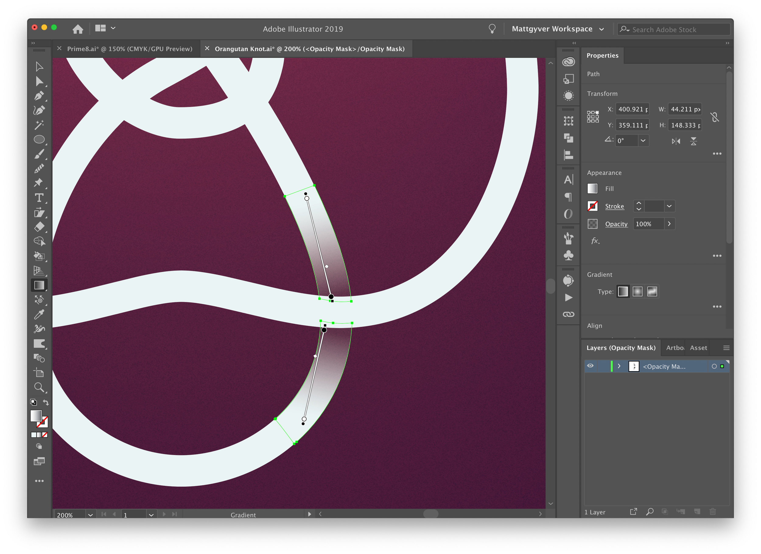
Click back to the working line art layer and select your knot. In the transparency panel select the black Opacity Mask square. This will put you into mask editing mode. Paste the line segments into the opacity mask in their same position (Ctrl+F or ⌘+F) and Expand Appearance so they become fills.
Here’s a little animation that should (hopefully) help with any confusion.
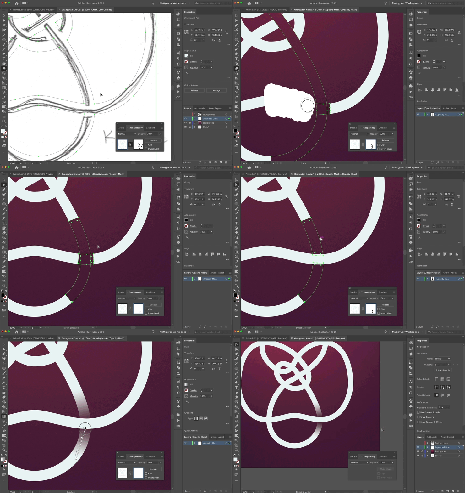
It’s important to grab both segments that form the intersection — one of them will be the transparent shadow/gradient, and the other will be a little cover to keep the overlapping line solid.
Take a peek at the initial sketch to see how things overlap.
Using the Eraser (Shift + E) tool, remove the bits of mask that don’t really matter. You will make two sections for the shadow/transparency, and one small section for the intersection top. Select and ungroup the shapes once you’re done erasing (to help with stacking order and applying gradients to each piece).
Make both of the shadow shapes black and white gradients and arrange the angle to give the appearance that the line is underlapping the intersection.
Make the little third shape a solid white color and bring it to the top. This will clean up any overspill from the gradients. You could also be really clever and just use shape builder to more precisely trim the two gradient shapes and not even bother with the little intersection cover piece.
A note on editing opacity masks: while you are in the mask editing mode, the rest of your document is protected — it's not possible to interact with anything other than elements within the opacity mask. Once you're finished editing, click back over to the layer inside the Transparency panel to leave the mask and resume editing the rest of the art.
Repeat this for each intersection: grab another set of lines that cross each other, copy them to the opacity mask, expand, erase the long ends, and apply gradients. Rinse and repeat.
Tighter intersections will be a bit tricker. But ideally you will want all the gradients to be consistent with one another. The opacity mask will look something like this.
Finished Knot Collection
Here’s the finished collection. I chose to include the knot notation for a little bit of typography (and as a nod to the math behind the inspiration).
Wrapping Up
Opacity masks can be a bit mysterious for newcomers, but once you get into it, the process is pretty easy and very powerful. Be sure to check out my other tutorial on Illustrator masking for more tips.


