So you saw a Turing pattern Photoshop tutorial? Let me slap the mouse out of your hand and show you the various ways to create the same beautiful Turing textures solely in Illustrator, and Illustrator alone. Vectors be praised!
Read MoreCommunicating data in clever and beautiful ways helps an audience absorb information more easily. This article covers various ways to work with data, bring that information into Illustrator, and create a beautiful data-focused poster.
Read MoreLet’s create a vibrant, retro aesthetic landscape using two of my favorite styles: synthwave and pixel art. This guide will walk through the process of using Illustrator to reduce any photo or reference into an intricate pixel piece, with all the glowing goodness a child of the 80’s would love.
Read MoreGet away from the usual Behance and Dribbble stuff and get inspired by the public domain images of yesteryear. Shake off those mental blocks and get the motivation to make something weird and wonderful… using other people’s work 😈
Read MoreGet those creative juices flowing! The design prompt for this challenge is to create a fictional beverage company—liquor, seltzer, soda, or whatever—based on your spirit animal. Really dig into the product lore and use modern tools and methods to craft something special.
Read MoreThe perspective grid is one of the more obtuse and finicky tools in Illustrator—it’s imprecise, buggy, and asks a lot of the user. Let’s take it for a spin!
Read MoreAdobe Illustrator is almost never the last step in a 3D project, but it can certainly be the first. Its new 3D tools have been redesigned to focus on simplicity and quality (and slowness 🥴) and allow designers to dip their toes into the realm of 3D compositions.
Read MoreA process for something I rarely do: architectural room renditions. Streamline your workflow to achieve a precise and beautiful hand-drawn interior design using a combination of free 3D interior design software, Illustrator, and Photoshop.
Read MoreThis museum diorama has a fantastic mood and my photo edits aim to pull out the wintry feeling one would get when viewing it in person. I used Lightroom exclusively to see what I could do with masks.
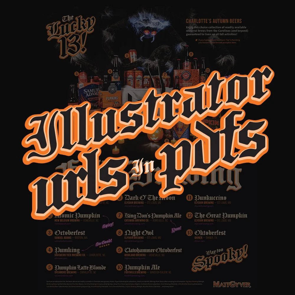
Read MoreA product shoot! Spooky season is fast approaching and so are the fall colors and festivals. This shot was for a single page magazine ad highlighting 13 choice brews readily available in the greater Charlotte area… also the spider’s name is Charlotte.
Read MoreIllustrator variables allow text URLs to behave like proper hyperlinks when saving the document as a PDF. It’s a useful trick to avoid relying on Acrobat or InDesign. Illustrator can be touchy however, so I’ve gathered a few tips to help.
Read MorePhoto manipulation and color correction for an old Keystone Olympic K-32 film camera. There were a few challenges in ‘Studio B’ so-to-speak, while I work on putting together a more permanent studio.
Read MorePhoto manipulation and color correction for a beach condo at Port Canaveral, Florida. I try to get up early (and stay out late) to grab all the good pics before humanity gets in the way 😉
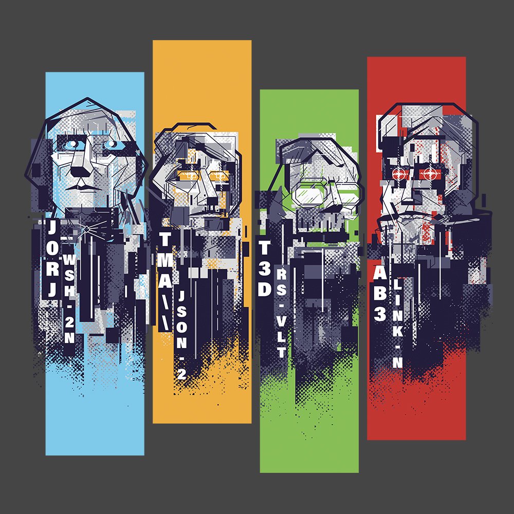
Read MoreI’ve always wanted to try my hand at glitch art by using random effects to create an unpredictable series of images. This tutorial highlights my process of creating bitmap textures in Photoshop, applying those textures to vector art in Illustrator, breaking things, assembling things, and hoping for the best!
Read MoreDesigning a playing card deck has always been one of those bucket list items for me. Playing cards can be relatively expensive and require lots of time (and artwork) to see the project through. After releasing two decks from two different printing providers, here are some tips and helpful links to get your deck idea off the ground.
Read More


