Urban Forager Branding
OVERVIEW
Get those creative juices flowing! The design prompt for this challenge is to create a fictional beverage company—liquor, seltzer, soda, or whatever—based on your spirit animal. Really dig into the product lore and use modern tools and methods to craft something beyond a simple logo and product mockup.
Over the course of this exercise, you’ll create a logo, labels, badges, typography, make 3D mockups with Adobe Dimension, Photoshop a little bit, photograph a little bit, and get some questionable help from Adobe Firefly and Bing’s AI. It’s going to be a real Mambo No. 5 of product design tasks.
Follow along as I walk through Urban Forager, my fun take on this project seen on my Twitch stream.
Logo
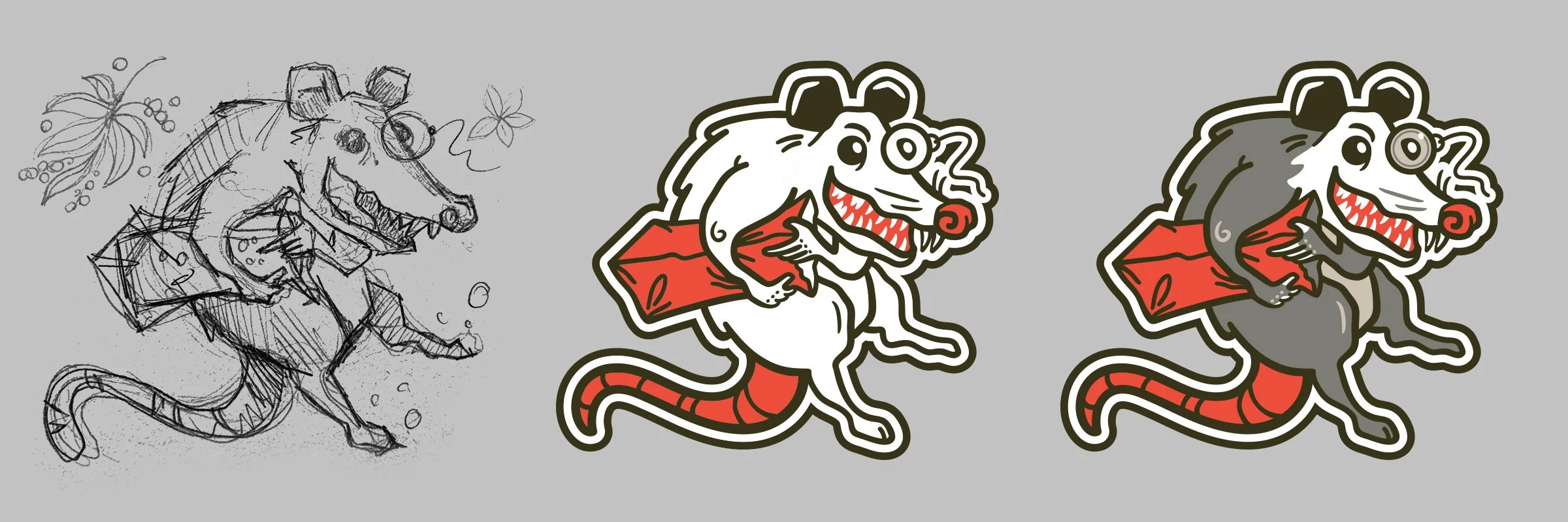
There’s an abundance of possum doodles in my notebook, so what better brand representative than this sketchy fellow with a monocle spiriting away an unknown beverage in a paper bag. The possum is my spirit animal.
Excellent, brand mascot achieved! Though he won’t have a name until the end 😉
At this point I hadn’t put a lot of thought into what the product will be. Everything is very low-stakes—there’s no problem to solve, no market to fill, to stakeholders to please—and because this project was almost entirely on stream for the fun of it, we’ll make it up as we go. I find moments of inspiration happen more often when chatting with viewers.
Product Concepts
What could a brown bag-toting possum possibly represent? Booze, that’s what. With his scavenging ways and sneaky nocturnal endeavors, this urban forager likely makes bathtub hooch using age-old prohibition methods and whatever ingredients he can scavenge.
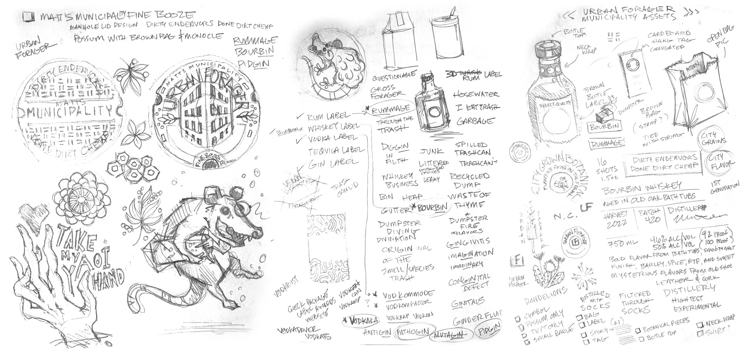
I worked up a few pages of notes, names, and ideas to generate an abundance of concepts. The name Urban Forager was settled on early because of the nature of foraging for ingredients (it’s an actual city thing) and brings an established level of understanding to the soon-to-be product.
Through the exercise of naming and riffing on concepts, the product was narrowed down to distilled beverages with a slightly trashy vibe: a rum called Rummage and a whiskey/bourbon called Bourbin. Both words are a play on their alcohol’s namesake and have a clever, discarded scavenger vibe, without being too gross.
Badge Design
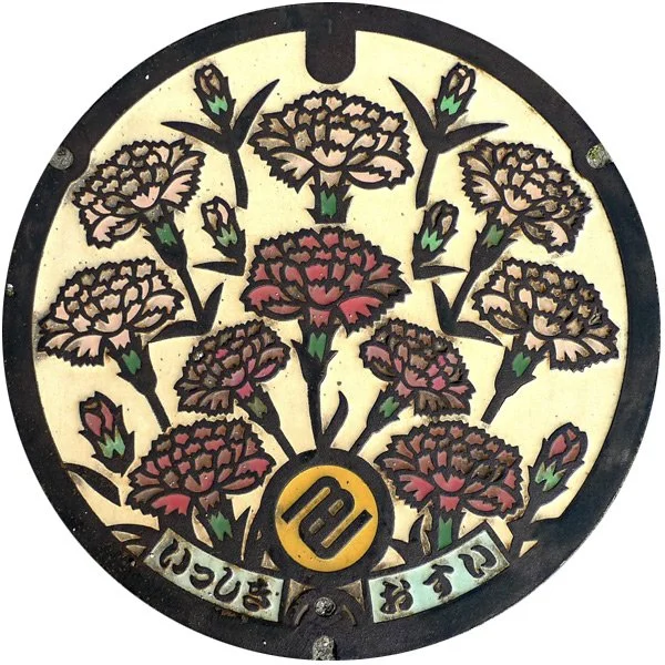
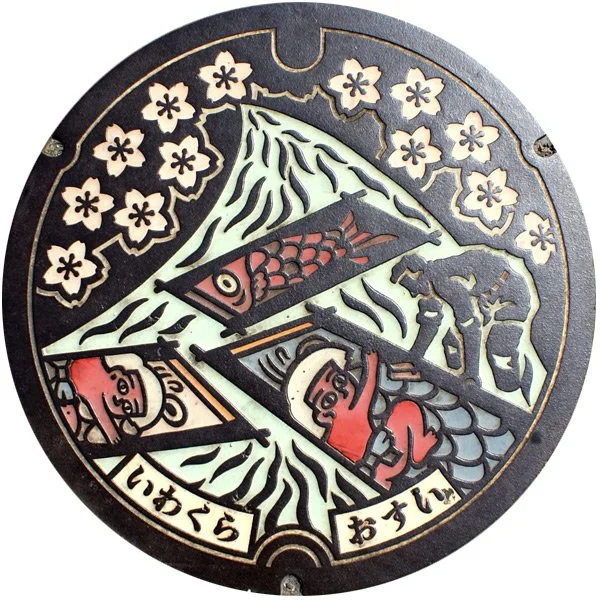
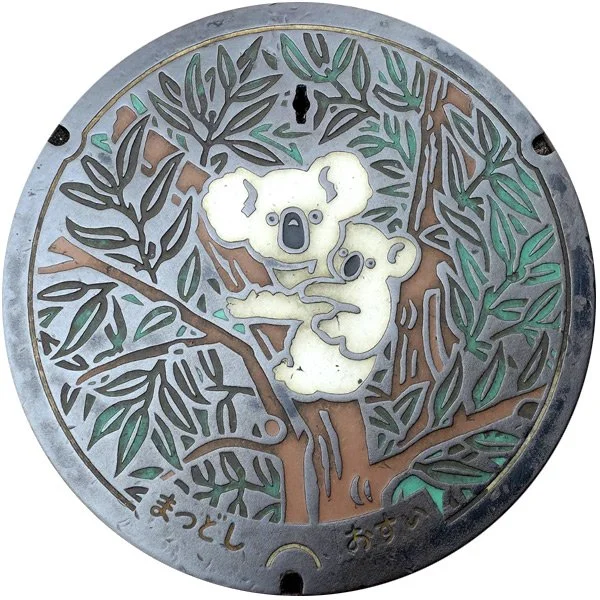
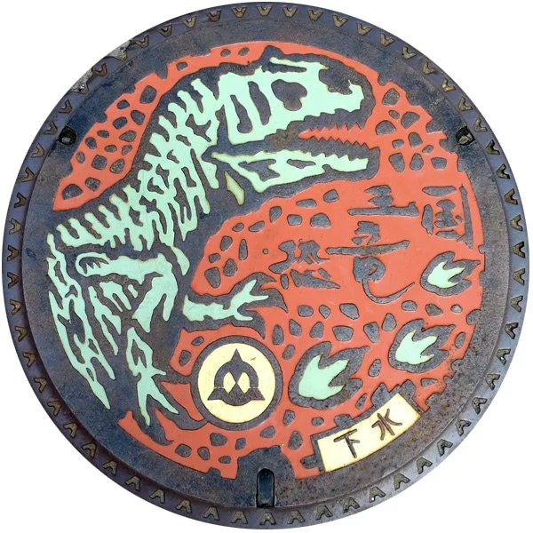
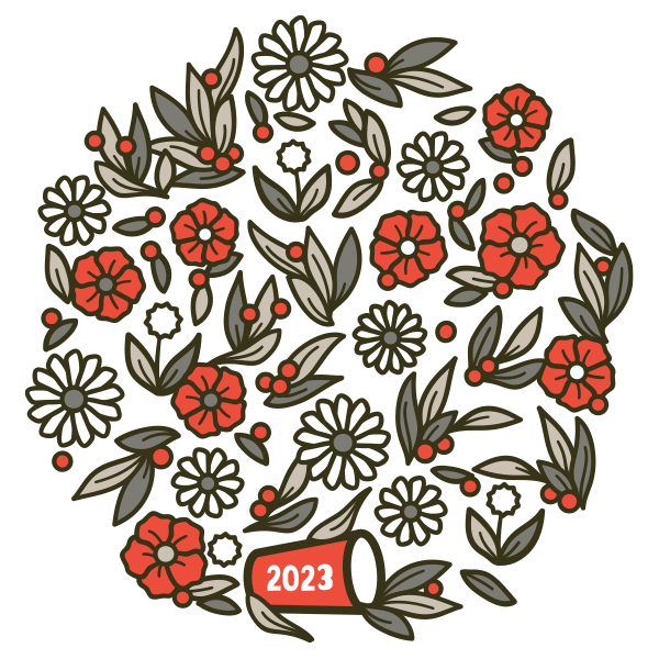
Once the product concepts are solid, it’s time to work up the actual logotype and illustration. Since everything is urban, I used this beautiful collection of manhole covers as inspiration for the Urban Forager mark.
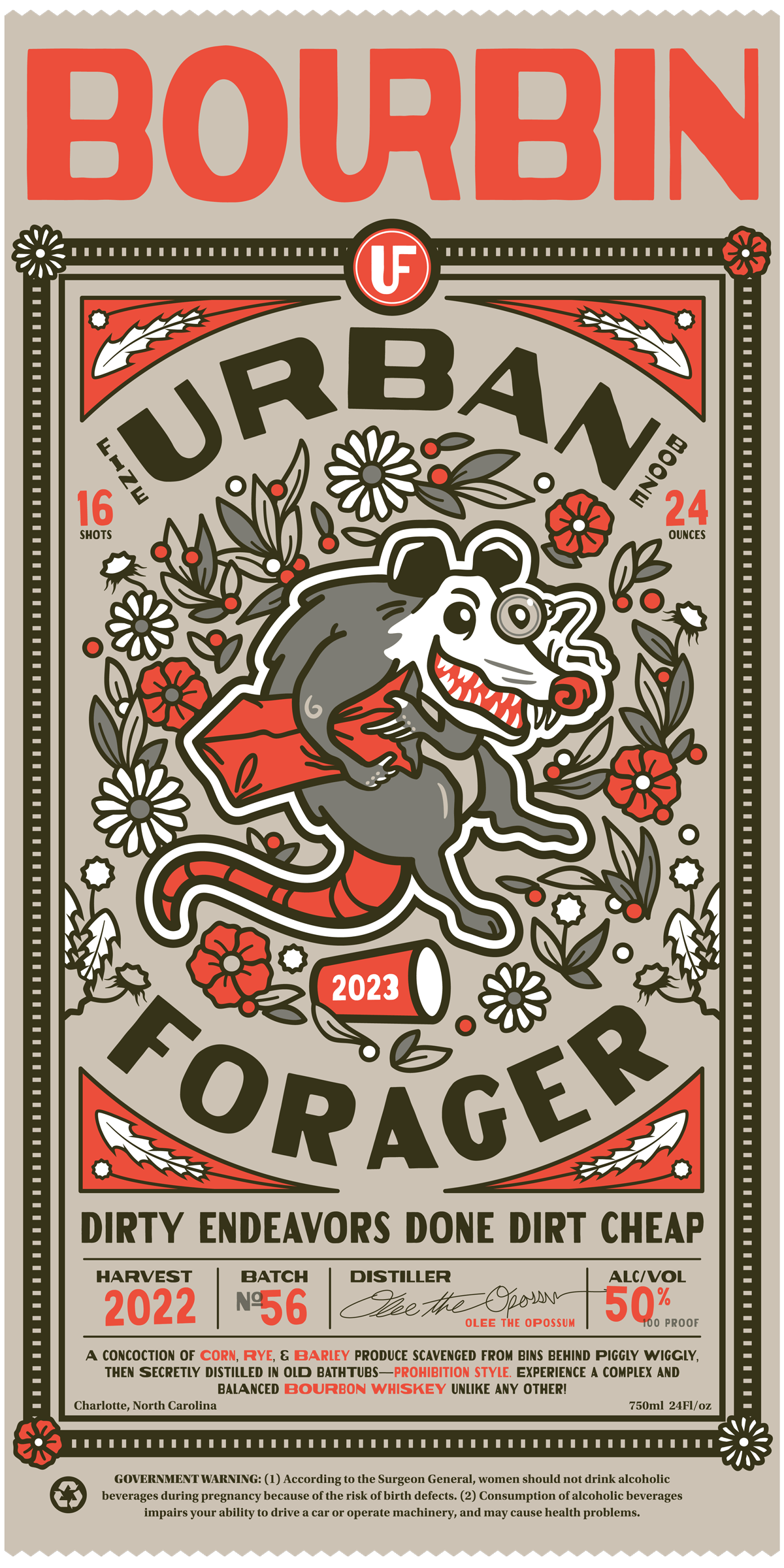
The implication here is that this liquor is perfect for those who want to taste the streets or return to the gutter. Incidentally, it also established a core brand value: inexpensive. With that in mind, I pulled together some additional flavor copy… you can thank JoJo’s Bizarre Adventure and AC/DC for the parody:
Dirty endeavors done dirt cheap
🥃
Dirty endeavors done dirt cheap 🥃
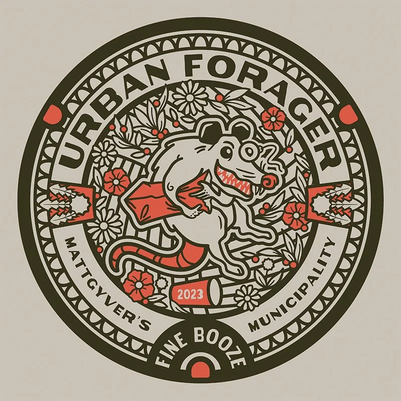
Here is the final brand mark, what a lovely city manhole! Keep in mind the various uses such as single color, reverse backgrounds, and so on.
Color Palette
The palette uses a single bold color with shades of tan/gray. I typically start with some colors in mind, but have been known to swap everything out last minute. It’s incredibly easy to adjust the palette using global colors in Illustrator, or use the Recolor > Generative Recolor feature.
Typography
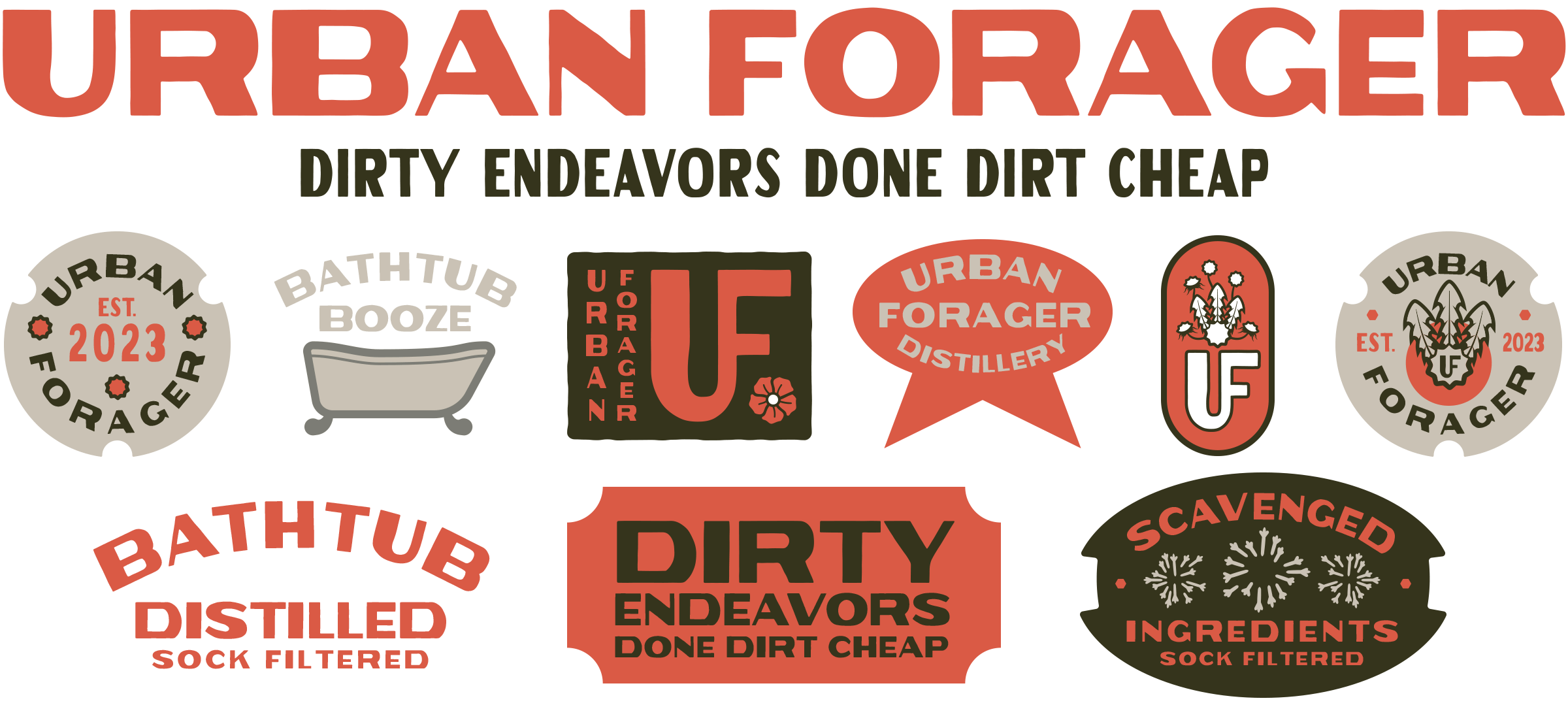
The logo and packaging will primarily use my Ranger Naturalist font. Here’s an exploration of various type treatments and arrangements. Really just throwing things at the wall to see what sticks.
The various marks, loose type styles, and organic stylings of the logo badge got me thinking about vintage apothecary and pharmacy labels. Detailed instructions, thick divider lines, text for the sake of text—instead of less is more, let’s try for more is more.
But first… we need a brand origin story.
Product Story
To further develop the Urban Forager lore, I fed my basic plot into the Bing AI, crossed my fingers, and hoped for something usable. My prompt:
“Write a children’s story about a possum that distills whiskey in old bathtubs, prohibition style, using ingredients scavenged from behind the grocery store.”
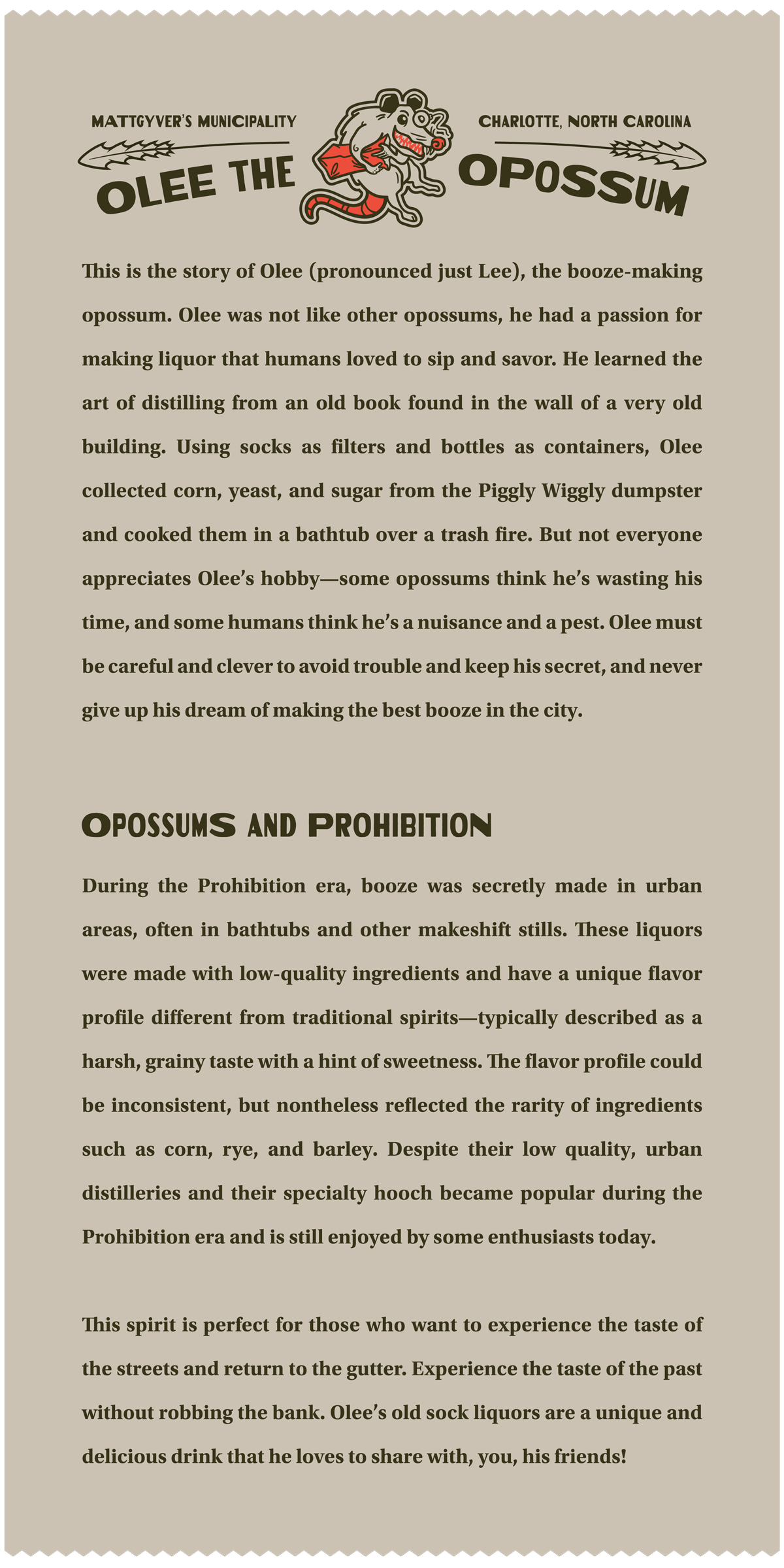
The results were… wow… WAY better than I imagined! With a little fine tuning for tone and tempo, I had a bona fide children’s story about a booze distilling possum, complete with a character arc, challenges, and mission statement. After trimming the story down to a paragraph, I’ve noted my minor adjustments from the AI in bold:
“This is the story of Olee (pronounced just Lee), the booze-making opossum. Olee was not like other opossums, he had a passion for making liquor that humans loved to sip and savor. He learned the art of distilling from an old book found in the wall of a very old building. Using socks as filters and bottles as containers, Olee collected corn, yeast, and sugar from the Piggly Wiggly dumpster and cooked them in a bathtub over a trash fire. But not everyone appreciates Olee’s hobby—some opossums think he’s wasting his time, and some humans think he’s a nuisance and a pest. Olee must be careful and clever to avoid trouble and keep his secret, and never give up his dream of making the best booze in the city.”
My copy edits included changing the original AI name from Ollie to Olee (shortened to Lee because the O in opossum is silent). The rest were simply terms I preferred; an actual silly store name, replacing alcohol and whiskey with the low brow term ‘booze’, and alluding that everything is distilled over a burning barrel in an alley somewhere.
Labels
Now that we have a story, I put the whole enchilada together to create product labels steeped in lore. Each bottle’s label is filled with important information: batch number, alcohol by volume, flavor characteristics, government warning (to spec, I looked it up 🥃) , and most importantly—the number of shots in a bottle.
The glue side of the label (readable after some of the contents are consumed) contains Olee’s story and a brief history of Prohibition era distilling and flavor profiles.
Hang Tags
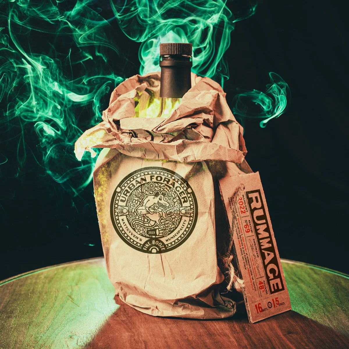
To really drive home the concept of affordable street booze, each bottle will be lovingly shoved into a brown bag and tied around the neck with a hang tag. Each tag will repeat some of the details from the bottle’s label in an abbreviated form.
Product Design
Now that all the labels are complete, it’s time to get crafty and make an actual prototype. Using a rum bottle, paper bag, string, and cardboard tag, I built a blank product mockup. One could go the extra mile and apply actual graphics to your bag/box/whatever for an authentic look, but we know Photoshop, so let’s do that instead.
I shot about 30 photos from various angles and chose a few to digitally label in Photoshop. The green smoke was a practical effect using a burning incense cone and off-camera speedlight with a green filter directly behind the bottle.
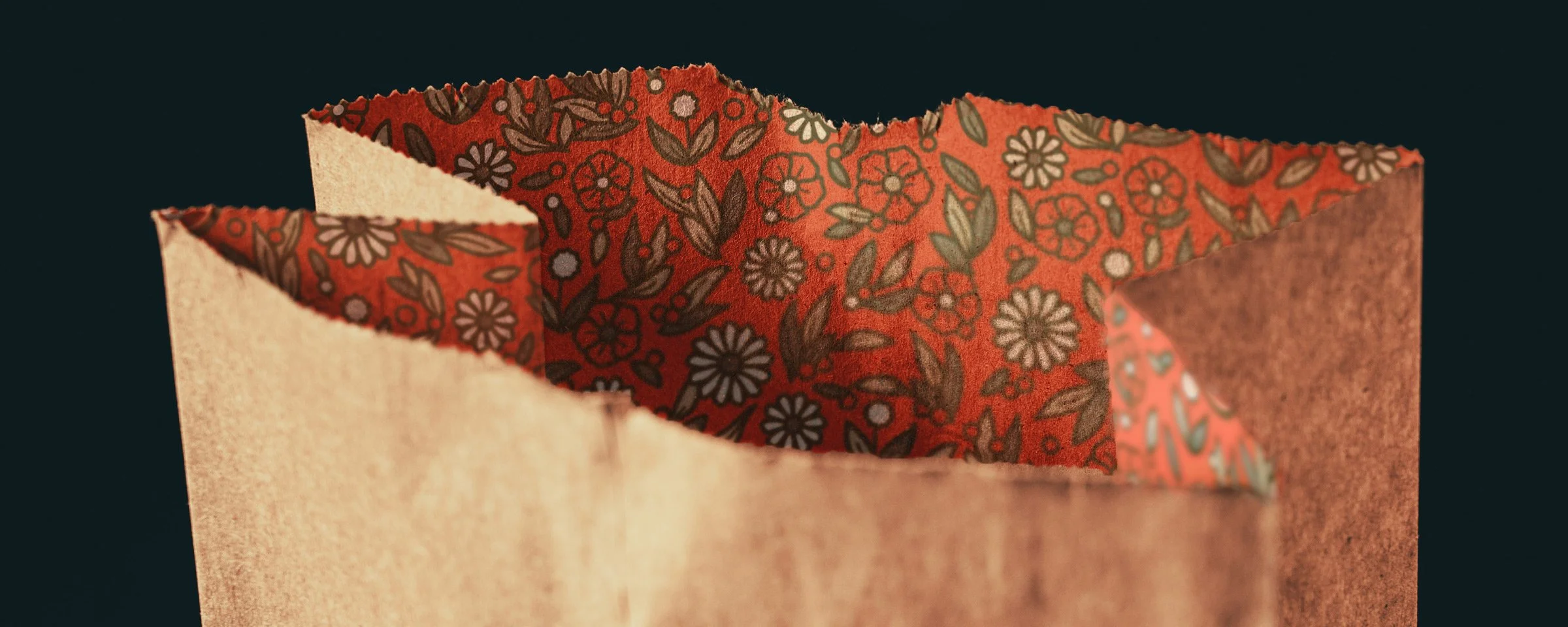
There was only one small regret I had when working up the product shots—I wanted the bag to have a luxurious printed pattern on the inside. Even a gutter snipe appreciates nice things, right? But by the time I finished the crumpling and bagging, it was simply too messy to realistically apply digitally.
The logo looks great on a t-shirt though, so I added on to the store. 🐭
3D Product Design
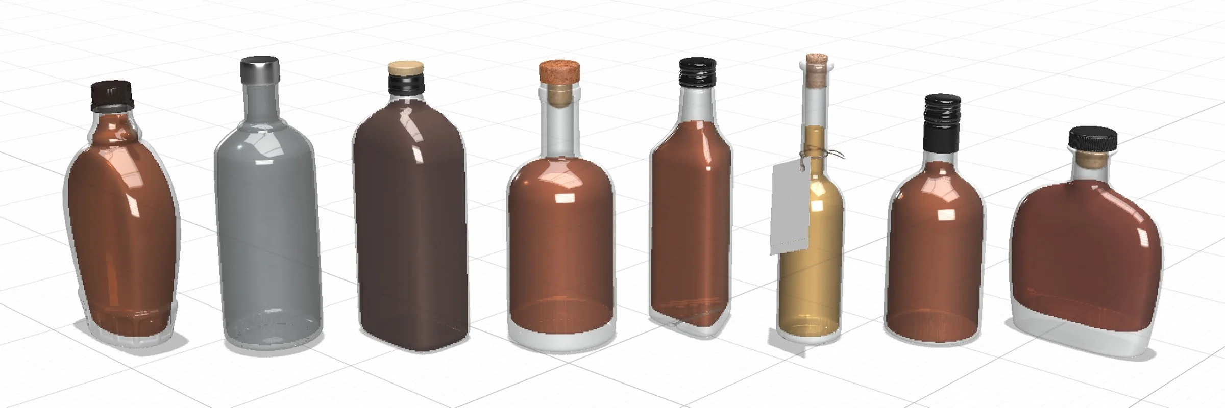
Because the rum used in the prototype is a lovely rum with a lovely label and it’s not empty yet, I couldn’t take it out of the bag for closeup shots. This is all just for fun and not a client assignment so let’s dust off Adobe Dimension and make a few 3D mockups instead.
These models are all available in the Dimension 3D object library, though most require spending a credit. I’ll use the center corked bottle below as it’s pretty close to the real thing.
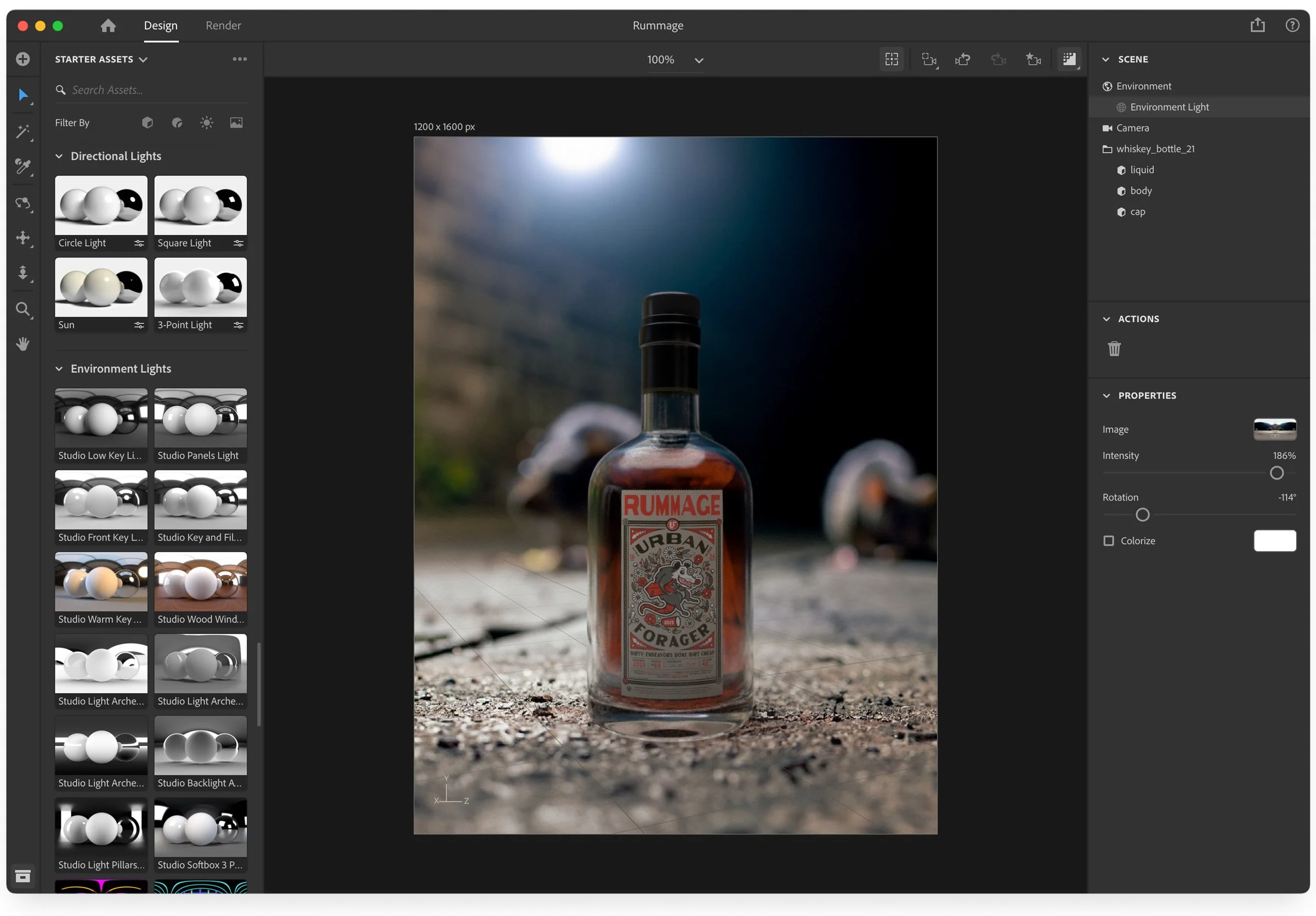
Since Dimension will let me use any backdrop and lighting setup, I couldn’t think of a better place to showcase Urban Forager than a nicely lit alley crawling with rats. But since I don’t have a sketchy rat infested alley near me, I used Adobe Firefly to generate a few dozen AI photos with this prompt: small marble on the pavement of a filthy alley, large rats scurrying in the background, night, macro photography shallow depth of field dslr vivid muted misty
The marble seen below was in every shot as a reference, and later removed from my two favorites before production. Some other minor adjustments were made using Photoshop’s Generative Fill, like adding the big foreground rat to the right (though it generally makes silly overly stylized images.)
Once the background was set and bottle placed, I boosted all the environment lights based on the backdrop, adjusted the rotation, and rendered everything. Rinse and repeat for the other label. You don’t even need to move the bottle—simply replace the label and backgrounds from the Properties panel and make sure the lighting looks decent.
Here are the final renders. A little additional work was done in photoshop to adjust the image curves, but only to brighten things up and enable the second shadow layer generated from Dimension. Overall not perfect, but not bad either.
Wrapping Up
This grab bag of design tasks was quite a workout! With all our modern tech, goofy AI, and the ability to easily “Photoshop” something, remember to stay sharp with the practical skills like crafting a nice story, prototyping a physical product, and photography 😉.
If you’ve created something using this design brief please let me know, I’d love to see your project! Thanks for reading.


