Before & After: Magazine Beer Spot
ISO 100 – 24 mm – f / 6.3 – 2 sec.
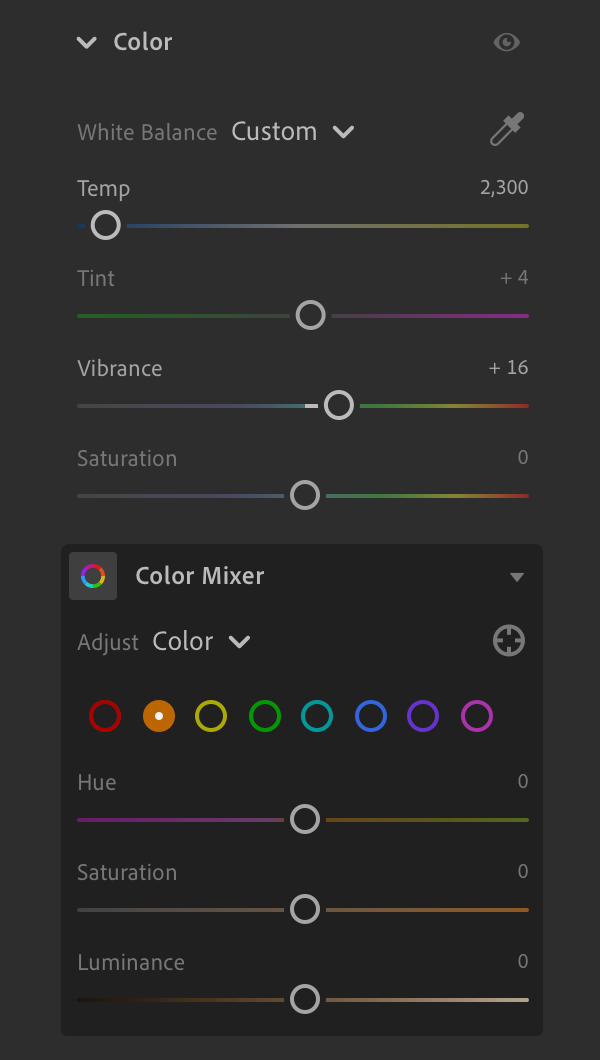
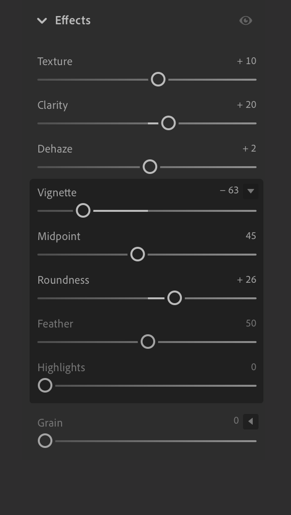
Overview: Lightroom edits for a product shoot.
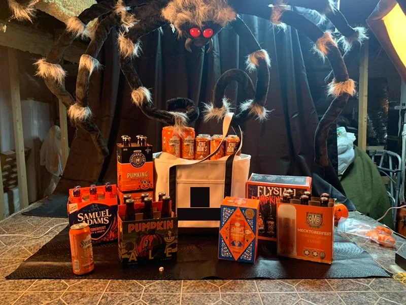
A product shoot! Spooky season is fast approaching and so are the fall colors and festivals. This shot was for a single page magazine ad highlighting 13 choice brews readily available in the greater Charlotte area… also the spider’s name is Charlotte.
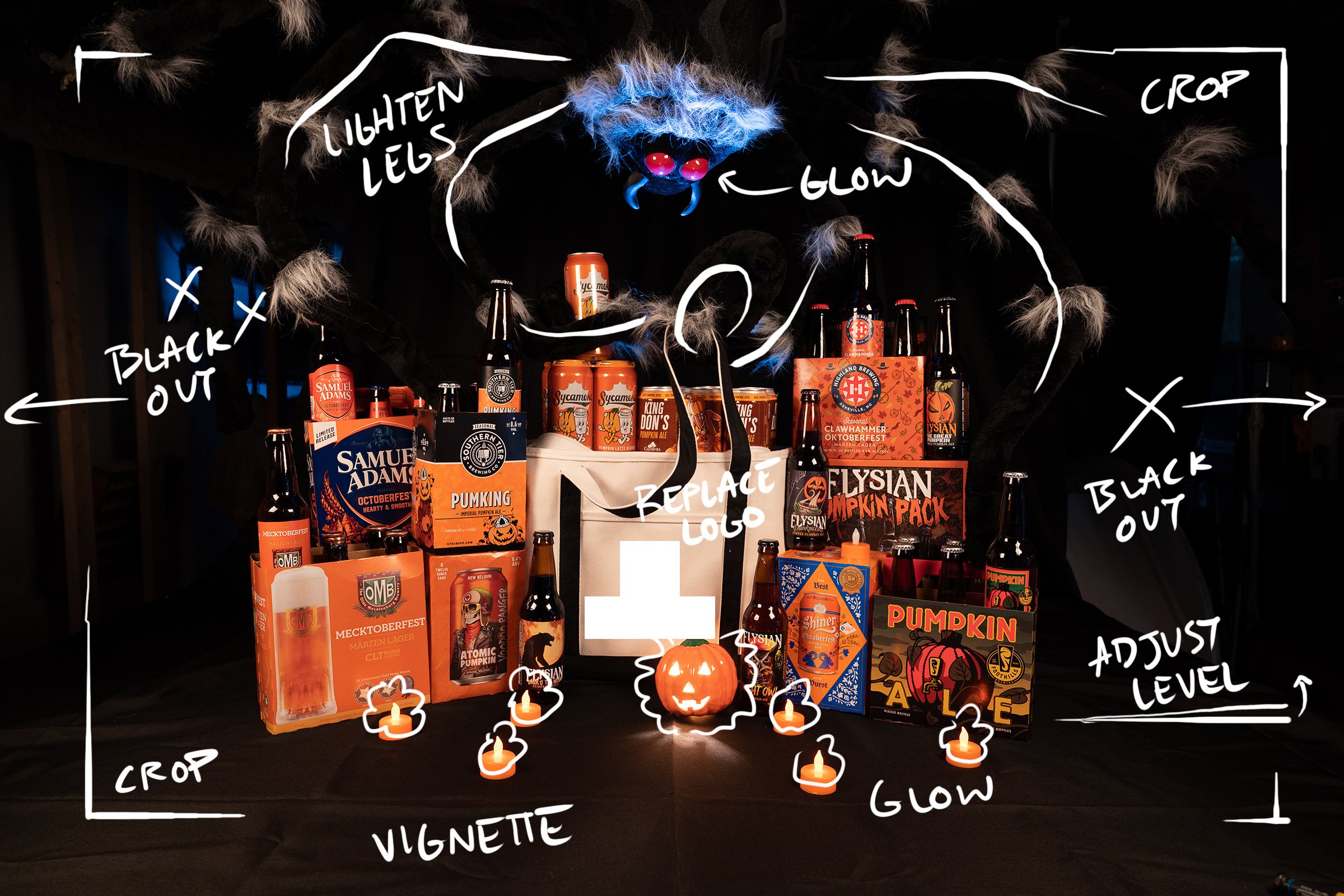
Photo Editing Notes
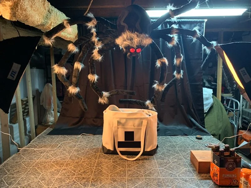
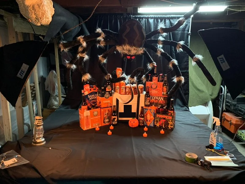
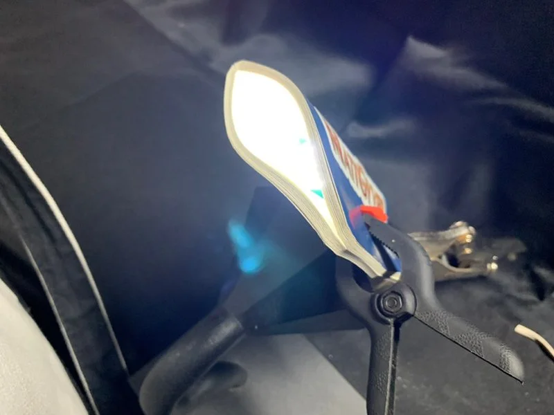
Larger product shots require larger backdrops and more table space, so my haunted basement studio got a small update. I’ve widened the backdrop with additional fabric, added a large black tablecloth, blocked out more light, covered some yellow ducts, and extended the shooting space. In addition to my pair of old JTL softboxes, I added a small flashlight equipped with a snoot to light the spider’s face. That delicious budget! 😜
Snoot?
Snoot!
The finished photo will be used on a solid black page surrounded by typography (below), so keeping things dark and centered was important for balance and copy space. The black tablecloth and backdrop helped isolate everything to make clipping fairly easy. Any remaining distractions were cleaned up in Photoshop.
Here’s the completed image. For more tutorial stuff and a PDF of this flyer, check out my Illustrator tutorial for making URLs in Illustrator behave like hyperlinks in a PDF — what a mouthful!

