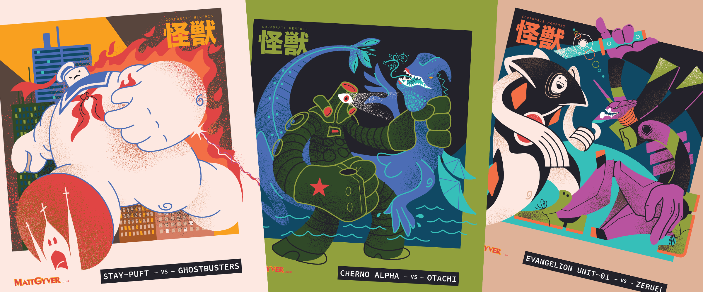
Corporate Memphis Kaiju
Overview
I’ve been feeling a bit nostalgic for some mid-century modern editorial illustration and inspired by the modern, terrible, trend of big tech vector art known as Corporate Memphis style. Popularized when Facebook introduced their Alegria visual illustration language in 2017 (from Buck studios), this art style has become ubiquitous throughout every industry. AIGA has a fantastic article and history in-brief.
Ease of creation and overuse has led to the public shunning of Corporate Memphis both casually and professionally (and popularly in memes) for being generic, lazy, overly minimalistic, visually offensive, insincere, pandering, conceptually off-mark, and clearly an attempt to sanitize public perception of dystopian big tech companies with over-the-top cloying optimism (wikipedia). With the bar set so low for quality and brand representation, these blandcore illustrations usually just come across as bizarre and visually offensive.
The Kaiju
My kaiju collection is inspired by the Corporate Memphis and editorial illustration style. With an emphasis on the exaggerated proportions, tiny heads, noodle limbs, questionable linework, simple color palettes, and reduction of the subjects into a devil-may-care form, these compositions have a bit more detail and expression than is customary for a soulless Alegria illustration, and I must live with that shame. Enjoy!
“NOBODY steps on a church in my town!” — Dr. Peter Venkman
Jaeger Cherno Alpha fighting Otachi in Pacific Rim
Not sure if that’s a banana…
Get in the robot, Shinji.
Tokyo Tower is a stomping hazard to the king of the monsters.
Emily Elizabeth and Clifford the Big RAD Dog.
Paul Bunyan Day is June 28; mark your calendars!
The notorious Big Bird representing the East Coast scene.
Some incredibly memorable Harryhausen creations—Bubo and the Kraken.
Ho ho ho! Check out the great big tender sweet peas on this giant!
Mothra loves lamp.
The Iron Giant is about to go nuclear to protect Hogarth.
Color palette commonly found among Corporate Memphis illustrations.
Wrapping up
What a fun collection! If I get around to making more I’ll be sure to add them to this article—thinking about AOT’s Colossal Titan, Cthulhu, and a couple others—but that’s a wrap for now. Thanks for reading!


