Spirited Away Illustrator Architecture
Overview
The bath house from Spirited Away is certainly one of the more haunting and surreal Miyazaki movie locations; there’s a captivating complexity about it. This is the second in my series of Studio Ghibli pieces, and I wanted to share a few details on creating the vector illustration. So turn on your pixel grids and get ready to snap things to it!
Reference
For this illustration I used reference images found at Animation Screencaps. It’s best to gather a few samples because the fine details in most Ghibli films vary from scene to scene.
Palette
This illustration uses a 6-color palette pulled from the above screen captures. It’s a bit on the weird gold and salmon side, with a dark red as the shadows. Each color is defined as a global to allow quick changes and experimentation later. The whole piece will strictly use these solid colors with no gradients or blending modes.
I always use HSB for my color mode (in a CMYK doc), it’s by far the easiest to adjust.
General Construction
The large entry and front face were the first pieces to be vectored, which helped set the overall scale for the rest of the bath house. I worked in sections; the front, the roof, the side with all the pipes, and so on. Blocking in the large shapes first and returning later for the smaller details. Because repeating patterns were central to the design, pixel snapping was enabled to speed construction and help keep elements aligned without the need for excessive guides.
The entire bath house sans shoji windows, roof ridges, and lattice work.
After finishing the main solid areas, the shoji-style windows were added, along with the other repeating regions: lattice, roof ridges, balcony railings, shutters, etc. Each area consists of simple two-line blended shapes using Object > Blend > Make.
Dashed Strokes & Blends
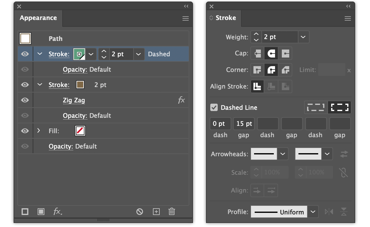
All the front-facing roof edges, trim, and pipes use dashed lines to some extent. Several strokes are applied to each path in the Appearance panel to create repeating dots, pipe seams, and tiles. Combined with simple blended lines, every roof has a clean architectural appearance.
Settings for the roof front edge.
The front roof edge is a single dashed line.
Settings for the wavy roof edge.
The roof edge is a dashed line and a wavy line.
Settings for the pipes.
Pipes are dashed lines on top of solid lines.
Using the Appearance panel to build depth and detail (multiple fills and strokes) into a single vector object keeps the overall art tidy and easier to edit, as opposed to several objects stacked on top of each other, all with different styles.
There’s nothing worse than trying to select a single object from a dozen in the same position — stumbling over each as you lock the ones you don’t need — until you finally find your desired vector. That same nonsense can almost always be accomplished using only a single object with a dozen strokes or fills instead… which is infinitely easier to manage from the Appearance panel.
Bitmap Textures
The sky and the building facade use single color bitmaps as textures. The benefit of using this type of image is the ability to change its color using the swatches in Illustrator, and it allows some experimentation without having to make any color edits in Photoshop or get lucky with blending modes.
The particular bitmaps used here are created in Photoshop from a photo by choosing Image > Mode > Bitmap… > Diffusion Dither, and saved as a PSD before being placed into Illustrator.
For a detailed look at creating bitmaps, check out my post on making the My Neighbor Totoro house.
Details
Story elements from the film were the last details added. Not being a Japanese speaker, I had to do a little research to figure out the hiragana and kanji used. There’s an interesting read and translation of everything here and more here. Miyazaki often incorporates themes and metaphors to his works, and Spirited Away is no exception – there’s plenty of clever naming and wordplay.
Wrapping Up
If you’re interested in the entire process from start to finish the video is available here.
Thanks for reading!


